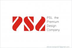
Re-style logo and corporate identity for Promotional Gift supplier / PSL World
Contest details:
Silver
- Contest holder: PSLWORLD
- Category: Logo & stationery
- Total budget: € 419.00
- Start date : 08-04-2014 14:43
- Ending date : 22-04-2014 14:36
- Status : Ended
- Required formats: psd,ai,pdf,indd
- Relevant files: None
-
Available languages:


- Number of designs: 47
-
Response rate:
low high
Needs:
When PSL (or mother concern Sweda) started in the late '70's the main focus were watches and electronics. The logo was based on one of the main selling items, a watch. You can clearly see the watch face and the hands if you look at our logo.
But today, in 2014, PSL is aiming to be more of a generalist when it comes to it's products.
Still very much focused on electronics and watches. But for instance, we have added a home section with kitchen items and we have added more non-electronic items over the last couple of years.
Since 2013 we have a new pay-off with our logo, 'The Premium Design Company'.
We would like to keep this pay-off intact, and even the Word Mark is to our satisfaction. But if there is a good suggestion we are open to it.
Our logo and corporate identity need to be more general now.
It needs to emit that we are a creative and original company.
It should not be too fancy, but modern and simple.
It could just be the company name as a word mark, but a good symbol or icon to represent our company is also a possibility.
We would like to see the logo implemented on stationary, envelops, business cards and e-mail signature.
If chosen we want to have a corporate identity manual.
Company description:
PSL is a global promotional gift supplier, the specialist in premium design.
18 global PSL sales offices are serving approximately 12.000 distributors in over 100 countries
Our PSL design studio in Hong Kong is fully dedicated to create new innovative products and designs for our own design label - PSL Design.
• We have over 300 products
• More than 50% of our collection is original PSL Design
• Our products are decided over 5 different categories: Office / Home / Leisure / Travel / Time
• Every month we launch new products to add to our collection, this way we keep our clients curious for us (Competitors release a catalogue 2 times a year, as is normal in our branche. We wanted to differ from this and release 1 catalogue in January en our monthly launches the rest of the year).
We are known in our branche and by our clients as a company that has fun and original gadgets. For lot of our (own PSL Design) items we use silicon as material, the silicon material makes us recognizable.
We operate in a B2B market. Our clients are distributors who sell to the end customer.
Please learn more about us on:
www.pslworld.com
www.psl-design.com
www.incentive-gifts.eu
www.facebook.com/pslworld
Target group:
Target group: B2B market, but the corporate identity can have a retail feeling to it.
Colors, favourites and other requirements
On a white background our logo has always been red (PMS 186C).
The red is seen as a signal color, and a lot of our marketing tools are based on this color (like exhibition stands etc.) We would like to keep this as a main color.
But on a colorful background there should be no problem to use the logo in white or in grey.
stevan banjac
-
-
No comments
-
This contest is finished. Its not possible to reply anymore.
-

