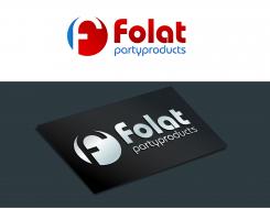
Restyle logo/corporate identity
Contest details:
Silver
- Contest holder: FOLATBV
- Category: Logo & stationery
- Total budget: € 419.00
- Start date : 21-10-2014 20:41
- Ending date : 20-11-2014 20:41
- Status : Ended
- Required formats: jpg,ai,
- Relevant files: None
-
Available languages:


- Number of designs: 127
-
Response rate:
low high
Needs:
It must be applicable on standard carriers such as our stationery. But also in brochures, signing,
website etc.
Company description:
FOLAT was founded in 1993 by Marc Mulckhuyse and Alex Adrichem.
They started in a 50m2 garage with a
passion for balloons and party products. First as distributor for strong brands like Anagram, Amscan and Qualatex, later on adding their own development of party products. With an innovative and
refreshing approach of the market,
they have built the company to a team of 45 people in 3 countries selling products throughout Europe.
After more than twenty years of
experience as a manufacturer of party products and distributor of strong brands and licences, Folat is building on further growth. Folat is responsible for a strong development of the category “party
products” in Europe and as a result of that Folat became one of the top 3
suppliers of party products in Europe.
Target group:
Folat has become one of the bigger players in the market. We supply party shops, but also several large chains, o.a.: Albert Heijn, Kruidvat, Action, Hema, Bart Smit, Inter toys and others.
Colors, favourites and other requirements
key words:
- recognition
- Maintain color
- Corporate appearance
- Reliability
- International
slamet77
-
-
Description by designer slamet77:
Hello Contest Holder,I made the design with initial "f" more recognizable.Please check it & provide your feedback,,thank you
Rgrds
Slamet77 -
This contest is finished. Its not possible to reply anymore.
-
-
-
FOLATBV says :
Zakelijk, strak en toch herkenbaar. Weet alleen niet precies wat het element voor moet stellen. Maar kan jij waarschijnlijk wel toelichten. Volgende week maken we een selectie van 2 of 3 waar we de laatste ronde mee verder gaan.
Gr. Reinier -
slamet77 says
Hello,thank you for your feedback...I was made the design from initial "f" in unique shape,simple & easy to remember.I try to avoid overused logo like "V" man,baloon etc,because in the brief you clearly said that folat is one of the big supplier in europe.And the most important thing is the logo will stand out with or without the text..."The best logo are simple" :)
Rgrds
Slamet77 -
FOLATBV says :
Could you maken the initial F in the logo element more regonizable?
It is now not easy to see.
Gr. Reinier -
This contest is finished. Its not possible to reply anymore.
-


