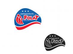
Restyle logo/corporate identity
Contest details:
Silver
- Contest holder: FOLATBV
- Category: Logo & stationery
- Total budget: € 419.00
- Start date : 21-10-2014 20:41
- Ending date : 20-11-2014 20:41
- Status : Ended
- Required formats: jpg,ai,
- Relevant files: None
-
Available languages:


- Number of designs: 127
-
Response rate:
low high
Needs:
It must be applicable on standard carriers such as our stationery. But also in brochures, signing,
website etc.
Company description:
FOLAT was founded in 1993 by Marc Mulckhuyse and Alex Adrichem.
They started in a 50m2 garage with a
passion for balloons and party products. First as distributor for strong brands like Anagram, Amscan and Qualatex, later on adding their own development of party products. With an innovative and
refreshing approach of the market,
they have built the company to a team of 45 people in 3 countries selling products throughout Europe.
After more than twenty years of
experience as a manufacturer of party products and distributor of strong brands and licences, Folat is building on further growth. Folat is responsible for a strong development of the category “party
products” in Europe and as a result of that Folat became one of the top 3
suppliers of party products in Europe.
Target group:
Folat has become one of the bigger players in the market. We supply party shops, but also several large chains, o.a.: Albert Heijn, Kruidvat, Action, Hema, Bart Smit, Inter toys and others.
Colors, favourites and other requirements
key words:
- recognition
- Maintain color
- Corporate appearance
- Reliability
- International
linda
-
-
FOLATBV says :
lettertype niet goed, te onduidelijk en schreeuwerig
-
This contest is finished. Its not possible to reply anymore.
-
-
-
FOLATBV says :
ook lettertype niet goed. Te stripachtig. Design wel leuk
-
This contest is finished. Its not possible to reply anymore.
-
-
-
FOLATBV says :
Gaat meer de kant op die we willen. De elementen die ballonnen moesten voorstellen in ons logo hoef je van mij niet te gebruiken.
kan er misschien wat diepte worden gegeven door een verloop of flow te gebruiken? Mag best wel iets verder van het huidige logo af, herkenbaarheid hoeft niet door alle elementen te gebruiken. -
This contest is finished. Its not possible to reply anymore.
-
-
-
No comments
-
This contest is finished. Its not possible to reply anymore.
-
-
-
FOLATBV says :
We worden nog niet enthousiast. Missen het gevoel dat je in de PDF uitleg ziet bij voorbeelden van andere merken. Belangrijk is ook een volwassen uitstraling.
Moderner en zakelijker. Dit blijft te speels.
- herkenbaarheid
- kleuren behouden
- Corporate uitstraling
- Betrouwbaarheid
- Internationaal
-
This contest is finished. Its not possible to reply anymore.
-

