Wanted: Cool logo and branding for a new small consultancy firm called WEL consulting
Contest details:
Silver
- Contest holder: sandravanrijswijk
- Category: Logo & stationery
- Total budget: € 419.00
- Start date : 11-06-2014 22:34
- Ending date : 16-07-2014 10:00
- Status : Ended
- Required formats: jpg,ai,pdf
- Relevant files: None
-
Available languages:


- Number of designs: 146
-
Response rate:
low high
Needs:
The company will be called WEL consultancy, WEL means the opposite of NOT, it means YES in a way, or TOO (as in: it can TOO!)
WEL delivers consultancy and management services based on a Japanese method. The japanese thing could be an inspiration.
Words that describe me, and therefore the company:
- Sparkle, glitter, radiate
- YES we CAN TOO!
- By connecting (dots, people...) you reach results.
- Step by step towards better fun, better results, better bottom line, happy customers
MIND YOU: my customers are large corporate environments. The branding should have a believable ring to it.
Company description:
A small consultancy firm, wich offers Lean consulting and Lean management services.
Lean is a method for improving customer value in your company, by improving processes, eliminating waste and teaching the entire staff how to continouously add value to your products and services.
Lean aims at doing JUST the things which add value, and stopping everything that you only do because of HR, or you must do because of the system, or people just thought this would help etc.
WEL consultany will be a one-man-business, featuring me :-)
I have close to 10 years experience in this field, which, in the Netherlands, is quite a lot.
Target group:
Large, medium enetrprises, which want to sustainably improve on their buisiness and their bottom line.
Lean is not a quick fix. It is a journey that will last for years, and will keep delivering results.
Colors, favourites and other requirements
These are more suggestions, no hard criteria, please surprise me.
I would not choose blue, too corney.
Also no red, too aggressive.
Some Japanese influences?
I would love for some sparkle to be incorporated. in any way you can imagine.
Zben
-
-
No comments
-
This contest is finished. Its not possible to reply anymore.
-
-
-
No comments
-
This contest is finished. Its not possible to reply anymore.
-
-
-
No comments
-
This contest is finished. Its not possible to reply anymore.
-
-
-
No comments
-
This contest is finished. Its not possible to reply anymore.
-
-
-
Description by designer Zben:
I forgot to say that the logo can be used with or without the company name.
-
sandravanrijswijk says :
And also, would you be so kind to make a version with dark to light purple in stead of dark to light grey? Just to see the difference in effect.
-
This contest is finished. Its not possible to reply anymore.
-
-
-
Description by designer Zben:
Hi,
Sorry for my english, I hope you will understand me.
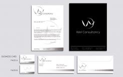
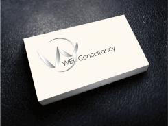
I choose this design because the W (Wel) and the inverted C (Consultancy) are used as symbols. Two birds (you and your client) together are going higher on a long way. The C can be interpreted as a symbol of the sun or the moon (maybe the yin or the yang or both). We can imagine the strength or the guidance of the sun and also the subtility and the good influence of the moon.
The design is delicate and neat. I didn't use a sparkling effect because it can render bad on prints, but I used a degrade effect to give volume on the image.
I didn't use colours because I think the logo gives an impression of serious and modernity in monochrome
Thank you for your comments and feel free to tell me if you want some modifications. -
sandravanrijswijk says :
I understand you perfectly, and am very impreessed by the design. You have a good shot to win the competition. Could you help me see the whole by adding tekst to the letter (address, taks numbers etc), the businesscard and the envelope? Thank you!
-
This contest is finished. Its not possible to reply anymore.
-
-
-
sandravanrijswijk says :
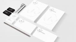
Very nice, Zben! Could you show me the rest of the branding? Letter, envelope, businesscard etc? Thanks! Sandra
-
This contest is finished. Its not possible to reply anymore.
-
-
-
No comments
-
This contest is finished. Its not possible to reply anymore.
-

