Wanted: Cool logo and branding for a new small consultancy firm called WEL consulting
Contest details:
Silver
- Contest holder: sandravanrijswijk
- Category: Logo & stationery
- Total budget: € 419.00
- Start date : 11-06-2014 22:34
- Ending date : 16-07-2014 10:00
- Status : Ended
- Required formats: jpg,ai,pdf
- Relevant files: None
-
Available languages:


- Number of designs: 146
-
Response rate:
low high
Needs:
The company will be called WEL consultancy, WEL means the opposite of NOT, it means YES in a way, or TOO (as in: it can TOO!)
WEL delivers consultancy and management services based on a Japanese method. The japanese thing could be an inspiration.
Words that describe me, and therefore the company:
- Sparkle, glitter, radiate
- YES we CAN TOO!
- By connecting (dots, people...) you reach results.
- Step by step towards better fun, better results, better bottom line, happy customers
MIND YOU: my customers are large corporate environments. The branding should have a believable ring to it.
Company description:
A small consultancy firm, wich offers Lean consulting and Lean management services.
Lean is a method for improving customer value in your company, by improving processes, eliminating waste and teaching the entire staff how to continouously add value to your products and services.
Lean aims at doing JUST the things which add value, and stopping everything that you only do because of HR, or you must do because of the system, or people just thought this would help etc.
WEL consultany will be a one-man-business, featuring me :-)
I have close to 10 years experience in this field, which, in the Netherlands, is quite a lot.
Target group:
Large, medium enetrprises, which want to sustainably improve on their buisiness and their bottom line.
Lean is not a quick fix. It is a journey that will last for years, and will keep delivering results.
Colors, favourites and other requirements
These are more suggestions, no hard criteria, please surprise me.
I would not choose blue, too corney.
Also no red, too aggressive.
Some Japanese influences?
I would love for some sparkle to be incorporated. in any way you can imagine.
SGP
-
-
Description by designer SGP:
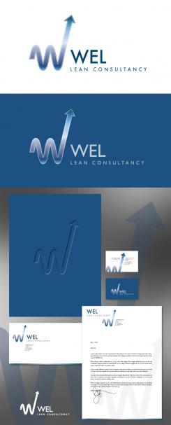
As you requested, here's a complete branding set in a nice blue. Let me know what you think :)
-
This contest is finished. Its not possible to reply anymore.
-
-
-
No comments
-
This contest is finished. Its not possible to reply anymore.
-
-
-
sandravanrijswijk says :
;-) this one reminds me a bit of two breasts ;-)
-
This contest is finished. Its not possible to reply anymore.
-
-
-
SGP says
Hello, any suggestions for improvement?
-
sandravanrijswijk says :
Dear SGP, thanks for your designs. In this one, I like the symbolism of the W. I also like the sparklei n the middle. i do not however like the color. Anything between blue and red would be more to my taste. Also, ik would like to see the letterhead, businesscards ans anything else you can design to complete the branding for my company? Look foreward to hearing from you. Sandra
-
This contest is finished. Its not possible to reply anymore.
-


