Wanted: Cool logo and branding for a new small consultancy firm called WEL consulting
Contest details:
Silver
- Contest holder: sandravanrijswijk
- Category: Logo & stationery
- Total budget: € 419.00
- Start date : 11-06-2014 22:34
- Ending date : 16-07-2014 10:00
- Status : Ended
- Required formats: jpg,ai,pdf
- Relevant files: None
-
Available languages:


- Number of designs: 146
-
Response rate:
low high
Needs:
The company will be called WEL consultancy, WEL means the opposite of NOT, it means YES in a way, or TOO (as in: it can TOO!)
WEL delivers consultancy and management services based on a Japanese method. The japanese thing could be an inspiration.
Words that describe me, and therefore the company:
- Sparkle, glitter, radiate
- YES we CAN TOO!
- By connecting (dots, people...) you reach results.
- Step by step towards better fun, better results, better bottom line, happy customers
MIND YOU: my customers are large corporate environments. The branding should have a believable ring to it.
Company description:
A small consultancy firm, wich offers Lean consulting and Lean management services.
Lean is a method for improving customer value in your company, by improving processes, eliminating waste and teaching the entire staff how to continouously add value to your products and services.
Lean aims at doing JUST the things which add value, and stopping everything that you only do because of HR, or you must do because of the system, or people just thought this would help etc.
WEL consultany will be a one-man-business, featuring me :-)
I have close to 10 years experience in this field, which, in the Netherlands, is quite a lot.
Target group:
Large, medium enetrprises, which want to sustainably improve on their buisiness and their bottom line.
Lean is not a quick fix. It is a journey that will last for years, and will keep delivering results.
Colors, favourites and other requirements
These are more suggestions, no hard criteria, please surprise me.
I would not choose blue, too corney.
Also no red, too aggressive.
Some Japanese influences?
I would love for some sparkle to be incorporated. in any way you can imagine.
Wilko
-
-
No comments
-
This contest is finished. Its not possible to reply anymore.
-
-
-
No comments
-
This contest is finished. Its not possible to reply anymore.
-
-
-
No comments
-
This contest is finished. Its not possible to reply anymore.
-
-
-
sandravanrijswijk says :
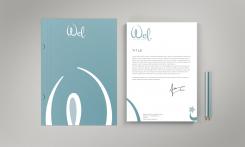
Dear Wilko, I really like your design, especially the colors an the way you integrated the logo into the letter and folder. I aslo like the fact that the font for Wel has a female feel to it. Some minor points for improvement, should you choose to adjust it: I thing the W has too much of a Disney feel to it. I like the idea, just tone it down a bit. The same goes for the star. Also too disney. Maybe you could keep the idea of continouous improvement in mind and symbolise that somehow? Or make the star into a subtle 'sparkle'? Let me know what you think. Best regards, Sandra
-
This contest is finished. Its not possible to reply anymore.
-
-
-
No comments
-
This contest is finished. Its not possible to reply anymore.
-
-
-
Description by designer Wilko:
Hello,
Here is my design for your logo.
I hope you will enjoy my work as much as I enjoyed working on your project.
I await your feedback and I remain at your disposal.
Sincerely
WILKO -
This contest is finished. Its not possible to reply anymore.
-

