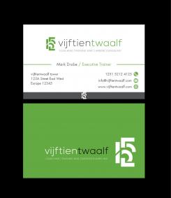
Wanted: logo and businesscard for a personal coach & trainer
Contest details:
Silver
- Contest holder: Mark Drube
- Category: Logo & stationery
- Total budget: € 419.00
- Start date : 19-12-2014 09:51
- Ending date : 07-01-2015 09:46
- Status : Ended
- Required formats: jpg,ai,pdf
- Relevant files: None
-
Available languages:


- Number of designs: 109
-
Response rate:
low high
Needs:
The logo should communicatie achieving your goals, selfreflection, answering to your calling,. I want to use the logo on my website and for starting a conversation
Company description:
Target group:
Colors, favourites and other requirements
djaya
-
-
Description by designer djaya:
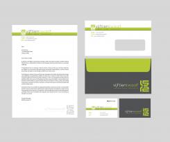
stationary design
-
This contest is finished. Its not possible to reply anymore.
-
-
-
Description by designer djaya:
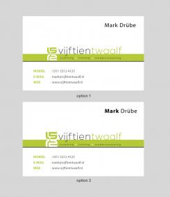
design revised. Please your review. Option 1 & option 2. Something a little changes that bring big impact. Thank you Mark
-
This contest is finished. Its not possible to reply anymore.
-
-
-
Description by designer djaya:
Hi Mark, I'm happy with our collaboration. It's very valuable to us. and keep in your mind, thant I AM OPEN TO UNLIMITED REVISION. Even if you choose my design as a winner or not. I am very happy to work with you.
-
Mark Drube says :
Hi Djaya,
thank u for your design. U made all the changes, many thanks. i really like it. now some details. u have mirrored the 15 and the twelve. when i look closely is see that the green line between the green 15 and the white 12 is not exactly in the middle. i makes that the numers are not exactly mirrored. can u make the green line in the middle please. -
Mark Drube says :
Hi Djaya,
i really like the design. when i compare your last two designs i see that your previous design has a "heavier"centre. the green line looks a bit firmer than your last. the white 12 has the same height a the green bar. can u do that also with your last design -
Mark Drube says :
thank u
-
This contest is finished. Its not possible to reply anymore.
-
-
-
Description by designer djaya:
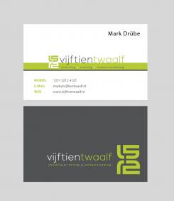
logo refining : please your suggestion
-
Mark Drube says :
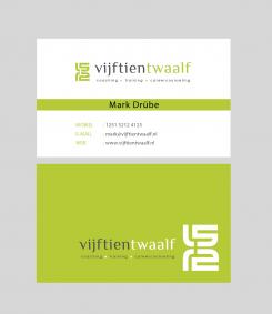
this layout i like. use the other logo please. can u use the characters/lettering of your 4th design (see comment)
-
Mark Drube says :
use the backside of your design below please ( with the logo in the down right corner)
-
Mark Drube says :
is this colour green different? if so, i like this one better.
-
This contest is finished. Its not possible to reply anymore.
-
-
-
Description by designer djaya:
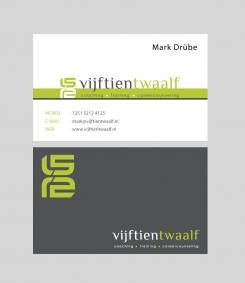
logo refining : please your suggestion
-
Mark Drube says :
this logo is nice ( with the horizontal stripe) set up of the card t great. your last contribution has a nive layout.
-
Mark Drube says :
I like the setup of the backside
-
This contest is finished. Its not possible to reply anymore.
-
-
-
Mark Drube says :
The other one was better. I dont like the black background. it looks a bit like a martial arts logo :)
-
This contest is finished. Its not possible to reply anymore.
-
-
-
Mark Drube says :
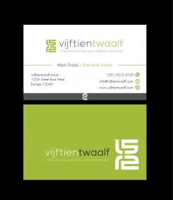
this one I like. The logo is a nice variantion on other designs i have seen. the font is nice too. I dont have an office so the part with the adres can be erased. I only need three icons: phonenumber, mailadres and webesite. My last namen is written with an ü (alt 129). my function doesnt have to appear on the businnescard. I like this colour better. I like a fresh green.
on the bottom of the card I see your other logo ( printed in the grey part of the card. i presume that that doesnt belongs there.
can u make some adjustments ? -
Mark Drube says :
i like these charakters
-
This contest is finished. Its not possible to reply anymore.
-
-
-
No comments
-
This contest is finished. Its not possible to reply anymore.
-
-
-
No comments
-
This contest is finished. Its not possible to reply anymore.
-
-
-
Mark Drube says :
Hi Djaya,
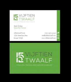
thanks u for your contribution. i do like the lay out of the business card. the colour green is a bit dull. a first the logo seems appealing but at second glance it is a bit of. -
This contest is finished. Its not possible to reply anymore.
-

