We need a new, fresh logo for our existing business after reclassification
Contest details:
Bronze
- Contest holder: PhilippRDMT
- Category: Logo & stationery
- Total budget: € 319.00
- Start date : 24-06-2015 12:09
- Ending date : 08-07-2015 11:56
- Status : Ended
- Required formats: jpg,ai,pdf
- Relevant files: None
-
Available languages:


- Number of designs: 63
-
Response rate:
low high
Needs:
That is why we need a new, modern and fresh design.
Current logo below: www.talsperre.de
The logo should the main lettering: "RDMT GmbH" included. When subtitles then is "Deformationsmesstechnik" provided.
It would be very nice if the main theme of "dam" in the logo is present. Otherwise, the focus on the topic "Measurement technics" is possible.
Please surprise me with your ideas!
Company description:
The company is a technical service provider for dam measuring technique which is used to monitor the stability of these structures. We are a small, solid company with customers primarily in Germany.
Target group:
- Operators of dams (authorities, Public institutions, energy producers.)
- Consultants
- Construction
Colors, favourites and other requirements
Please keep in coloring to our current colors (orange / anthracite or orange / black)
Look also: www.talsperre.de
Strajo
-
-
Description by designer Strajo:
Hi,
Here is my last work, It has something new and something old. I wanted this to be all i have done in one work that is why i put something that was seen. Through previous works i haven't changed logo because it is simple and the picture tells everything, i have just added stationary. It was nice making logo ideas for you, and i hope that you will like it. :) -
PhilippRDMT says :
Thank you very much!!!!
I hope my colleges like your design too.
I will discuss it in my company.
Good work! -
This contest is finished. Its not possible to reply anymore.
-
-
-
Description by designer Strajo:
Hi,
Here are some more exeples of stationary for your company. I hope that you will like it and feedback -
This contest is finished. Its not possible to reply anymore.
-
-
-
Description by designer Strajo:
Hi,
Here is an exemple of logo on t-shirts. I hope that you will like it and feedback. -
This contest is finished. Its not possible to reply anymore.
-
-
-
Description by designer Strajo:
Hi,
Here are some examples of stationery for your logo. I hope that you will like it and feedback -
PhilippRDMT says :
Hi,
thank you very much! I like it!
I hope my colleges think the same about it.
-
This contest is finished. Its not possible to reply anymore.
-
-
-
Description by designer Strajo:
Hi,
I have seen your feedback and made few changes. Also i have put a business card. I hope that you will like it and feedback -
PhilippRDMT says :
Hi,
Thank you very much! This is now my favourite! -
Strajo says
I am very glad for hearing that... :)
That being sad, is there anything more that you want me to make except business card? And are there any changes i should made on logo? -
This contest is finished. Its not possible to reply anymore.
-
-
-
Description by designer Strajo:
Hi,
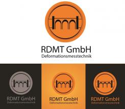
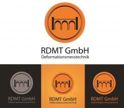
I have read your feedback about returning to old logo, so i have made changes that you sad. If i am right it should look like this... I hope that you will like it adn feedback -
PhilippRDMT says :
Hi, Thank you again.
You have added on each side two lines. Please delete the bottom line. The other line is perfect. -
This contest is finished. Its not possible to reply anymore.
-
-
-
Description by designer Strajo:
Hi,
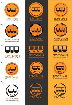
I have seen your feedback and made some changes as you can see. Also i have put 5 exemples of logo. I hope that you will lke it and feedback. -
PhilippRDMT says :
Hi,
thank you very much!
Maybe we go back to your first idea...
Can you please add 2 horizontal lines on the left and right side of the picture from your dam? The line should go from your dam to the circle. You understand?
http://www.t-online.de/regionales/id_65599314/talsperre-klingenberg-im-osterzgebirge-fertig-saniert.html
https://de.wikipedia.org/wiki/Talsperre_Lehnmühle#/media/File:LehnmühletalsperrreAug2007.jpg
-
This contest is finished. Its not possible to reply anymore.
-
-
-
Description by designer Strajo:
Hi,
Here is my idea of logo. I didn't want to complicate it because it can be done with just orange and black. Also between i put a dark orange to set apart the inner logo with outer. I hope that you will like it and feedback. -
PhilippRDMT says :
Hi, Thank you for idea. It's good, but it does not convince me.
My feedback:
- the picture looks like a bridge, not like a dam. Maybe you have an other.
- It could be more peppy.
I would be pleased if you could still sacrifice some time for it. -
This contest is finished. Its not possible to reply anymore.
-


