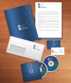
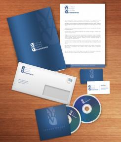
Young Venture Capital Investments
Contest details:
Silver
- Contest holder: jmu
- Category: Logo & stationery
- Total budget: € 349.00
- Start date : 09-03-2013 13:04
- Ending date : 03-04-2013 12:52
- Status : Ended
- Required formats: jpg,ai,pdf
- Relevant files: None
-
Available languages:


- Number of designs: 89
-
Response rate:
low high
Needs:
Company description:
We are an Investment company (venture capital) that invest in start-ups or take a share in an existing company. We aim at companies with a turnover of approx. 2-4 mln euro on yearly basis with approx. 50 FTE (employees).
Target group:
(Hi-)Tech companies or start-ups. Telecom related (services to build mobile or fixed networks) and Internet & E-commerce companies.
Colors, favourites and other requirements
Free format. YVC Investments can be fully written, but YVC can also be used. The new logo does not have the need to have the letters YVC included.
mikidejanovic
-
-
Description by designer mikidejanovic:
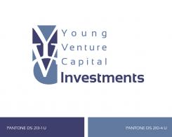
Yes, colors of this design are the PMS colors (dark blue - PANTONE DS 213-1 U & light blue - PANTONE DS 210-4 U) Can send EPS or AI format, just tell me in which e-mail
-
mikidejanovic says
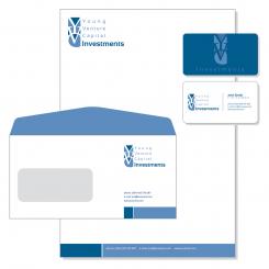
I made changes to the envelope
-
jmu says :
I guess we are almost there. Can you design a presentation template (powerpoint and/or prezi). That will be our last request. The challenge ends next wednesday April 3rd. We will then select you as our winner and that will be the moment where you have to upload all files etc.
Regards -
This contest is finished. Its not possible to reply anymore.
-
-
-
mikidejanovic says
power point presentation can be downloaded here:
http://www.sendspace.com/file/a8vpz1
Regards -
jmu says :
Miki, Thanks for the brandbook. Is it still possible to make us a presentation template in Powerpoint as a standard for our presentations in the future?
-
jmu says :
Miki, Thanks for the brandbook. Is it still possible to make us a presentation template in Powerpoint as a standard for our presentations in the future?
-
mikidejanovic says
If I understand you correctly, you're asking me whether you can use this presentation in the future. Yes, of course.
-
This contest is finished. Its not possible to reply anymore.
-
-
-
jmu says :
Miki, thanks for the updates. Impressed. Just to be sure. Can you deliver these designs in .EPS or .AI format, is it also possible to receive a presentationformat. Last but not leased the colours need to be based on PMS.
Hope to hear from you soon.
Regards -
mikidejanovic says
I'm glad you like my design. Tell me which e-mail address to send you what you asked for
Greetings -
jmu says :
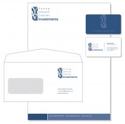
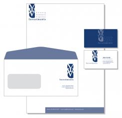
Miki, can you confirm to me that colours of this design are PMS colours? The envelope window needs to move towards left top, the logo can move right. No address or email info on the envelope please.
-
This contest is finished. Its not possible to reply anymore.
-
-
-
No comments
-
This contest is finished. Its not possible to reply anymore.
-
-
-
No comments
-
This contest is finished. Its not possible to reply anymore.
-
-
-
Description by designer mikidejanovic:
Best regards
Miki -
This contest is finished. Its not possible to reply anymore.
-
-
-
Description by designer mikidejanovic:
Yes, the width is the same as you can see
-
This contest is finished. Its not possible to reply anymore.
-
-
-
Grafic ART says
Gentlemen, when I was checking out this contest, looking for a possibility to join the contest I came across this proposal.
Having many years of experience with an envelope manufacturar, let me give you some (free) advice. Better not design envelopes with a coloured flap like these. The only way to produce these well is to order specially made series in a dedicated production run where the paper is printed before the actual enveloes are made. I don't know the size of the intended stock but this method is quite costly. Even then you will encounter production problems: sometimes blue will show on the front and sometimes there will be white onthe back.
With the regular way of printing standard stock envelopes the flap cannot be printed that way. The closest thing you can get is having the contours of the flap outlined in white (so the ink will not touch the edges of the paper). But these contours differ with each manfacturar and series. In practise this coloured flap is not a good thing to do.
I agree: on the whole the design looks very nice.
Kind regards,
Jan Terlouw -
This contest is finished. Its not possible to reply anymore.
-
-
-
Description by designer mikidejanovic:
Dear all, I tried to follow your suggestions
Regards,
Miki -
jmu says :
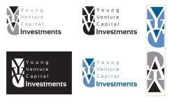
Are the width of YVC part of the logo top and bottom the same? It now seems that the width at the bottom is wider then at the top. I think they should be the same? Can you also show me a grey version?
-
jmu says :
You are one of last two designers from where we will pick our favourite. Can you show us this version in dark blue? The envelope should be white with only our logo and address. Looking forward to your adjustments.
-
This contest is finished. Its not possible to reply anymore.
-
-
-
jmu says :
I appreciate this design, think the scale of the logo (YVC part) versus the text part can be improved. Would like to see some more options in which some more colour options are shown and the colours are a bit more outspoken.
Regards -
This contest is finished. Its not possible to reply anymore.
-
-
-
No comments
-
This contest is finished. Its not possible to reply anymore.
-
-
-
No comments
-
This contest is finished. Its not possible to reply anymore.
-
-
-
No comments
-
This contest is finished. Its not possible to reply anymore.
-

