Design a symbol/emblem
Contest details:
- Contest holder: MySafeHouse
- Category: Other
- Total budget: € 250.00
- Start date : 29-05-2012 16:59
- Ending date : 20-06-2012 16:56
- Status : Ended
- Required formats: jpg,ai,pdf
- Relevant files: None
-
Available languages:


- Number of designs: 89
-
Response rate:
low high
Needs:
I do not give Asian or Japanese martial arts, so the logo should not include depictions of Japanese or Chinese characters exude. No cobras, tigers or other animals, etc.
The look of the logo should be strong, sober and simple, with no star to be. Flexibility, breathing and movement are pillars of my method of self defense. My lessons are based on so-called organic self-defense. That means you are using the natural movement mechanisms, properties and reactions of humans. The strengths and weaknesses of the body, supplemented by available factors in your environment, such as a chair, bench, wall, car, bicycle, but also items like an umbrella, bag, book, etc.
The method of self defense is unexpected and effective. The defense seems innocent or almost by accident, but the defense is very purposeful, effective and often invisible to outsiders. In defense, the spiral of violence, the extent to which you respond, very important. So appropriate violence in a confrontation. You can layer in the spiral or high. Depending on the aggressor and the necessary response to effectively defend yourself.
In my teaching I use 360 + degrees, actually it has to do with the areas that you should be able to be active in or to escape + keep an oversight in; front / rear, left / right, four diagonals, high / layer and around rotating (as a spiral).
The core of my training system is to rely on five basic components that are all interconnected; one (1) of these five elements is central. The independent interconnectedness of these five elements is an essential part of the vision of my training.
With my training I want to contribute to a safe living environment. I teach individuals, business market and professional groups (police, defense, special units).
Company description:
Target group:
Colors, favourites and other requirements
charles_arvin
-
-
charles_arvin says
some feedback would be nice, thanks in advance :)
-
charles_arvin says
still waiting for some feedback :)
-
charles_arvin says
still waiting for some feedback :)
-
charles_arvin says
still waiting for some feedback :)
-
charles_arvin says
sorry, my browser sended three times. this was not intended..
-
MySafeHouse says :
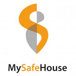
Thanks for your design; i like a lot, my partners therefore need some time, they compare a to a medical sign. I like the S protecting the person. We are planning to expend the date further than today, 14 days longer. Of course you will here from me. Thanx again, gr. Raymond
-
MySafeHouse says :
Hoi, bedankt voor je inzending. Ik heb beoordelingen toegevoegd omdat vandaag de wedstrijd gaat sluiten. We zijn overeen gekomen met een andere designer, bedankt voor je inzendingen, succes verder!
MvrGr. Raymond -
This contest is finished. Its not possible to reply anymore.
-
-
-
charles_arvin says
Hey Raymond, i made two diffrent versions. as you can see, the version beside my text has an other kind of s which looks more like a motion. hope you guys like it. i think in combination with the shield it makes a impression of safety. kind regards! charles
-
This contest is finished. Its not possible to reply anymore.
-
-
-
No comments
-
This contest is finished. Its not possible to reply anymore.
-
-
-
charles_arvin says
Hey Raymond, your definition of the symbol makes a lot of sense. so now i have taken the transparency out of the person, and the s is going around her, so it looks more like protection in my opinion. I can give the grey more brightness if you want. Hope you like it :) charles
-
charles_arvin says
Hey Raymond, your definition of the symbol makes a lot of sense. so now i have taken the transparency out of the person, and the s is going around her, so it looks more like protection in my opinion. I can give the grey more brightness if you want. Hope you like it :) charles
-
MySafeHouse says :
Hello Charles; Yes i like it much better like this. I'll definitely keep it in mind and wil discuss it with my partners. You will hear from mee, thanx again for now!
Gr. Raymond -
MySafeHouse says :
Hey Charles, i spoke to my partner and basicly we liked this symbol; do you think it is possible to put 'motion/movement' in it. We like the S protecting the person. Do you also think you could make like a shield around it, like you see in the army or whatever; it makes it stronger en we can also in the futuse complete it with a text around or above it. I hope to hear from you. Thanx. Raymond
-
This contest is finished. Its not possible to reply anymore.
-
-
-
No comments
-
This contest is finished. Its not possible to reply anymore.
-
-
-
No comments
-
This contest is finished. Its not possible to reply anymore.
-
-
-
charles_arvin says
this logo is signifying a evil grey spirit and a proud s for safe, self-defense and selfconfidence.
-
This contest is finished. Its not possible to reply anymore.
-
-
-
No comments
-
This contest is finished. Its not possible to reply anymore.
-
-
-
MySafeHouse says :
Hello, thank you for sending your symbols. This last one is very inspiring for me. The 'S' and the grey spirit/person wich represents 'my' in MySafeHouse. Of course i hope to recieve more symbols from other designers, but must say that i like yours.
Thanx, Raymond -
This contest is finished. Its not possible to reply anymore.
-

