Desing for our booth
Contest details:
Gold
Needs:
We want to change that now. In a total of 4 contests we are looking for a designer that can manage this.
In this contest is about our booth. Files and photos to our booth you will find under www.i-mondi.com/download/Messestand.zip
The stand already exists. It is 4 meters wide and 5 meters deep and it has in the back on the left side a 1 x 1.5 meter cabin, and a column with two tables in the middle. The walls are 2.75 meters tall and white. As we will not expose items higher than 2 meters this area above is to be used for branding. This means that we put foils on the walls in the area of 2 meters to 2.75 meters. The files should be 100 x 75 cm. In the lower area 0.0 meters to 0.4 meters we not expose. So this area can be foiled too is necessary.
On the first meter on the left side - we will put boards in order to presente our craft projects. Please check the image with boards in the Zip-File.
WHAT IS DELIVERED
1. Foils for wall surface
a. 14 x 100 x 75 cm for the upper area
b. 14 x 100 x max. 40 cm for the lower area (optional)
2. Foils for the walls of the cabin
a. 1 x 100 x 75 cm for the door
b. 1 x 100 x max. 40 cm for the bottom of the door (optional)
c. 1 x 150 x 75 cm front of the cabin
d. 1 x 150 x max. 40 cm for the bottom of the front of the cabin
3. Foils for the entrance
a. 2 x 200 x 40 cm for the entrance (According to measures.pdf the height is 30 cm - in fact the height is 40 cm)
4. Folis of the column
a. 2 x 80 x 75 for logo and any further information
5. Set the color for the carpet
6. Set color of the boards for the presentation of craft projects
PLEASE CREATE AN ILLUSTRATION SO THAT WE CAN IMAGINE YOUR DESIGN
- Please deliver everything in inDesign with meaningful and labeled layers. If you linked graphics of Ilustrator and/or Photoshop, please also deliver them with meaningful and labeled layers.
- The texts are not to be converted in to paths.
- If you participate in this contest, you should ideally also participate on the other 3 contest of i-Mondi. It is important that your results matches together, if I've seen the catalog and than I get something else of the company i Mondi - I must IMMEDIATELY think "aaaaaaaah this is also of i-Mondi"
The other contest are about this:
1. Packing-Design
2. Corporate Design
3. Catalog-Design
Company description:
Target group:
Colors, favourites and other requirements
h.geenen
-
-
Description by designer h.geenen:
Hi,
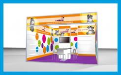
This is de exhibition stand with the logo and website address on separate locations. Also, in the original design only 2 types of Basti's were used. We've added 2 extra Basti's in this design. Your comments are welcome!
Kind regards,
Hein -
This contest is finished. Its not possible to reply anymore.
-
-
-
Description by designer h.geenen:
Dear sir,
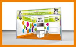
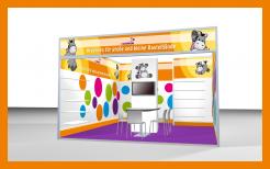
We've put in your website address and we've made the logo bigger. The green looks really fresh and clean, but of course we understand that you wish to keep it all orange. If there is anything we need to change, do not hesitate to contact us,
Best regards
Hein Geenen -
iMondi says :
2014
-
This contest is finished. Its not possible to reply anymore.
-
-
-
Description by designer h.geenen:
and a design in green...
-
iMondi says :
Green is very, really very nice, but we will definitely not work with green at this moment - also not for the catalog and packing
-
This contest is finished. Its not possible to reply anymore.
-
-
-
Description by designer h.geenen:
Dear Sir,
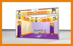
We've adjusted the panels for the stand as requested. We've also tried to put in the shelves and the column. Your comment is again very welcome!
best regards
Hein Geenen -
iMondi says :
I am missing the website - and the logo needs an own spot as it is too smal
-
This contest is finished. Its not possible to reply anymore.
-
-
-
Description by designer h.geenen:
Dear Sir,
Herewith you will find our first design for the stand. Every panel will of course be delivered to you in the requested formats. We also made designs for your corporate identity, and a packaging header. Catalogue will follow later. We will upload them at the other contests...
Your comment is very welcome,
Best regards
Hein Geenen -
iMondi says :
Thank you for that great propose. So far my feedback. What I like of your Design:
- Actually it is really nice even though I have nothing special to point-out
What I don’t like:
- That the plain-white circle for the logo
- That you have used the wrong Illustration ( I miss my table with the column in the middle, I miss the TV on the column and the boards for the craft-projects.) -
h.geenen says
Dear sir,
Thanks for you comments, we'll work with that. Do you have another image of the stand with the tv and the column in the middle with appr. the same view as the picture we used now? We'd like to hear from you,
best regards
H. Geenen -
This contest is finished. Its not possible to reply anymore.
-


