Design of a folded A3 brochure for a communication agency
Contest details:
Gold
Needs:
Company description:
We are a Parisian Web Agency proposing: websites creation(main activity), Google Search Engine Optimization, social medias, smartphone applications, graphic designs and prints.
Target group:
Professionals
Colors, favourites and other requirements
Clear, simple, nearly schematized/over simplified, design, modern, elegant and with a professional aspect.
shwin
-
-
shwin says
Hi, I have uploaded a few altered designs here.
I am unable to speak french, so found it quite difficult to understand what you wanted.
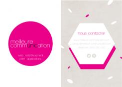
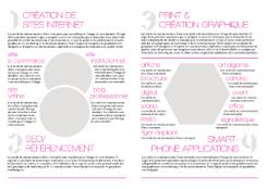
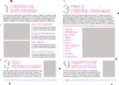
I went for a clean, minimal design. The picture does not show the textures and patterns I applied to the grey and pink elements very well. I feel the textures would be a big aspect of this brochure when printed. -
This contest is finished. Its not possible to reply anymore.
-
-
-
shwin says
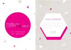
I also altered the front page with some scattered shapes, still keeping it minimal. I personally like the design with the shape elements.
I also realize the front and back cover are the wrong way around. -
This contest is finished. Its not possible to reply anymore.
-
-
-
shwin says
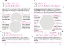
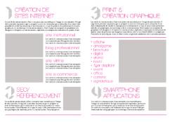
I have used these shapes as a focal point of the brochure (images are intended to replace them)
-
This contest is finished. Its not possible to reply anymore.
-
-
-
shwin says
floating elements
-
This contest is finished. Its not possible to reply anymore.
-
-
-
shwin says
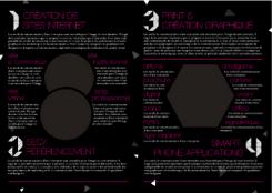
I personally love the contrast of the black inside the brochure.
-
This contest is finished. Its not possible to reply anymore.
-
-
-
shwin says
floating elements
-
This contest is finished. Its not possible to reply anymore.
-
-
-
shwin says
If there is anything you think I could make better please let me know and I will try my best to make it fit your needs.
-
This contest is finished. Its not possible to reply anymore.
-


