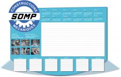
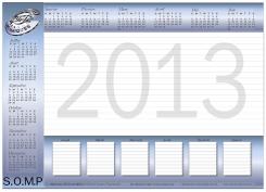
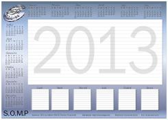
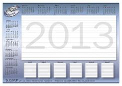
desk blotter
Contest details:
Bronze
Needs:
Primary Nord / Pas de Calais
Secondary: Northern France (to Paris)
Tertiary: France + Belgium
In hand for:
- Responsible for maintenance (strong predominance of men)
- Responsible production (strong predominance of men)
- Procurement and purchasing managers (women and men)
We are currently 80% of our turnover in the primary zone.
Company description:
Hello,
We want to create a desk blotter that will vector image with our customers throughout the coming year.
Desk blotter will be composed of 25 pages 90g / m², duplex Quadri.
Target group:
We are a precision engineering. We exist since 1947.
our business is the manufacture of mechanical parts for our clients from various industries (steel, paper, packaging, energy, food, etc..).
The service is also increasingly highlighted (reactivity, troubleshooting, consulting, etc.).
Colors, favourites and other requirements
We currently have a logo which is the evolution of an old logo.
- Our logo must be present
- A large part of the hand should help in taking notes
- This note area may be free or divided
- Contact information should be included in the hand.
- It is possible to add organizational information (calendar, etc.).
- The administrative information (SAS No. Siret, VAT, etc.) are not necessary, it is a promotional document.
In general, we want something new.
Thank you read and follow the file "file information"
webissimo
-
-
webissimo says
Bonjour
J'ai bien noté vos remarques et j'ai voulu marquer le trait sur un élément important de votre demande.
J’ai donc utilisé la version secondaire du logo, ce trouvant en pied de page du PDF cette version étant "moderne"
le logo proposer initialement sortant tout droit des années 90 la difficulté étant de faire du moderne avec du rétro
les styles s'entrechoque.. voici donc ma proposition.
Cordialement
-
Thomas D says :
Bonjour,
Désolé, je n'accroche pas.
Cordialement. -
This contest is finished. Its not possible to reply anymore.
-
-
-
Thomas D says :
Bonjour,
Merci pour votre création.
J'ai quelques remarques pour faire avancer le Schmilblick:
- intégration du logo S.O.M.P. pas terrible
- Jour du calendrier en Français plutôt qu'en Anglais
- Logo pas assez mis en valeur
- Plus généralement, typo et architecture générale pas assez moderne.
Cordialement. -
This contest is finished. Its not possible to reply anymore.
-
-
-
No comments
-
This contest is finished. Its not possible to reply anymore.
-
-
-
No comments
-
This contest is finished. Its not possible to reply anymore.
-


