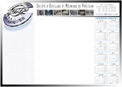
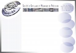
desk blotter
Contest details:
Bronze
Needs:
Primary Nord / Pas de Calais
Secondary: Northern France (to Paris)
Tertiary: France + Belgium
In hand for:
- Responsible for maintenance (strong predominance of men)
- Responsible production (strong predominance of men)
- Procurement and purchasing managers (women and men)
We are currently 80% of our turnover in the primary zone.
Company description:
Hello,
We want to create a desk blotter that will vector image with our customers throughout the coming year.
Desk blotter will be composed of 25 pages 90g / m², duplex Quadri.
Target group:
We are a precision engineering. We exist since 1947.
our business is the manufacture of mechanical parts for our clients from various industries (steel, paper, packaging, energy, food, etc..).
The service is also increasingly highlighted (reactivity, troubleshooting, consulting, etc.).
Colors, favourites and other requirements
We currently have a logo which is the evolution of an old logo.
- Our logo must be present
- A large part of the hand should help in taking notes
- This note area may be free or divided
- Contact information should be included in the hand.
- It is possible to add organizational information (calendar, etc.).
- The administrative information (SAS No. Siret, VAT, etc.) are not necessary, it is a promotional document.
In general, we want something new.
Thank you read and follow the file "file information"
Rgotte
-
-
No comments
-
This contest is finished. Its not possible to reply anymore.
-
-
-
No comments
-
This contest is finished. Its not possible to reply anymore.
-
-
-
No comments
-
This contest is finished. Its not possible to reply anymore.
-
-
-
No comments
-
This contest is finished. Its not possible to reply anymore.
-
-
-
No comments
-
This contest is finished. Its not possible to reply anymore.
-
-
-
Description by designer Rgotte:
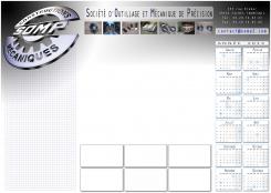
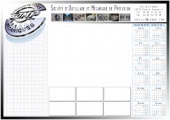
Une troisième et une quatrième version avec des "bulles" pour infos importantes.
-
This contest is finished. Its not possible to reply anymore.
-
-
-
Description by designer Rgotte:
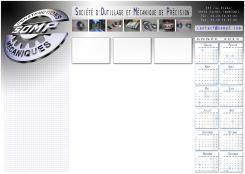
Voici une deuxième version avec le calendrier 2013 inclus.
-
This contest is finished. Its not possible to reply anymore.
-
-
-
Description by designer Rgotte:
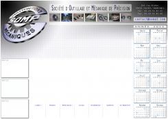
Bonjour, je commence le concours en proposant ce premier design.
j'espère pouvoir l'améliorer suivant vos commentaires et appréciations. Merci d'avance. -
Thomas D says :
Bonjour,
Merci pour votre création.
L'ensemble est épuré et clair. L'integration du quadrillage est réussi.
Par contre, je ne suis pas fan des formes à droite.
Cordialement. -
Rgotte says
Je pensais les formes à droite comme des "bulles" pour noter des informations à mettre plus en évidence.
je peux travailler sur un autre design, ou bien pensez-vous que vous préférez plutôt un calendrier 2013 ? (ou les deux...)
Merci d'avance pour votre réponse -
This contest is finished. Its not possible to reply anymore.
-


