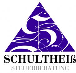
New Stationary & Logo for Tax Consultancy Office
Contest details:
- Contest holder: TomiK
- Category: Stationery design
- Total budget: € 305.00
- Start date : 13-03-2012 18:40
- Ending date : 23-03-2012 18:32
- Status : Ended
- Required formats: jpg
- Relevant files: None
-
Available languages:


- Number of designs: 68
-
Response rate:
low high
Needs:
Company description:
The consultancy office exists sice 1992, which was also when the old Logo was designed. Since 2005 the consultancy is managed and owned by mrs.Shultheiß. The detailed information for the stationary will be send to the contest winner after the contest ended.
Target group:
Small to middle size companies, frellancers and private households.
Colors, favourites and other requirements
The logo should be re-designed with a feminine touch. Nevertheless it is important that the Design is still recognizable as the same company. Our idea was to use the colour purple for the Logo to underline the feminine toch, but alternatives are welcome as well.
716
-
-
No comments
-
This contest is finished. Its not possible to reply anymore.
-
-
-
No comments
-
This contest is finished. Its not possible to reply anymore.
-
-
-
No comments
-
This contest is finished. Its not possible to reply anymore.
-
-
-
Description by designer 716:
Mal eine ganz andere Richtung
-
This contest is finished. Its not possible to reply anymore.
-
-
-
Description by designer 716:
Design des "S im Dreieck" ist an die Geschichte des Namens "Schultheiß" angelehnt: das "S" habe ich im Stil des Mittelalters gesetzt, gleichzeitig sind die dekorativen "Schwünge" ein Zeichen für Dynamik.
-
716 says
Die Farben des Dreiecks und der Schrift können natürlich gerne noch angepasst werden :).
-
This contest is finished. Its not possible to reply anymore.
-


