New Stationary & Logo for Tax Consultancy Office
Contest details:
- Contest holder: TomiK
- Category: Stationery design
- Total budget: € 305.00
- Start date : 13-03-2012 18:40
- Ending date : 23-03-2012 18:32
- Status : Ended
- Required formats: jpg
- Relevant files: None
-
Available languages:


- Number of designs: 68
-
Response rate:
low high
Needs:
Company description:
The consultancy office exists sice 1992, which was also when the old Logo was designed. Since 2005 the consultancy is managed and owned by mrs.Shultheiß. The detailed information for the stationary will be send to the contest winner after the contest ended.
Target group:
Small to middle size companies, frellancers and private households.
Colors, favourites and other requirements
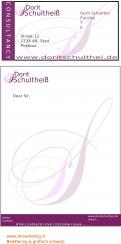
The logo should be re-designed with a feminine touch. Nevertheless it is important that the Design is still recognizable as the same company. Our idea was to use the colour purple for the Logo to underline the feminine toch, but alternatives are welcome as well.
-
designer: WDTWari
-
designer: KONOZ
-
designer: 716
-
designer: 716
-
designer: 716
-
designer: WDTWari
-
designer: WDTWari
-
designer: s4marketing
-
designer: s4marketing
-
designer: s4marketing
-
designer: s4marketing
-
designer: s4marketing
-
designer: s4marketing
-
designer: Hartmann
-
designer: Q
-
designer: Q
-
designer: Q
-
designer: LordBecks
-
designer: LordBecks
-
designer: Jayzone
-
designer: Jayzone
-
designer: Jayzone
-
designer: Jayzone
-
designer: Jayzone
-
designer: Jayzone
-
designer: Jayzone
-
designer: kolbo
-
designer: Sonnenkind
-
designer: Sonnenkind
-
designer: jqueton
-
designer: Tanaj
-
designer: annette007
-
designer: WDTWari
-
designer: LordBecks
-
designer: Tanaj
-
designer: Tanaj
-
designer: donmax
-
designer: Artstudio-E.B
-
designer: 716
-
designer: 716
-
designer: medienviren
-
designer: savaal
-
designer: savaal
-
designer: savaal
-
designer: Sonnenkind
-
designer: Sonnenkind
-
designer: savaal
-
designer: annette007
-
designer: annette007
-
designer: annette007
-
designer: annette007
-
designer: artfox
-
designer: artfox
-
designer: checkoutDes
-
designer: checkoutDes
-
designer: checkoutDes
-
designer: checkoutDes
-
designer: nherz
-
designer: donmax
-
designer: donmax
-
designer: jose127
-
designer: jose127
-
designer: 10us
-
designer: 10us
-
designer: facito
-
designer: WDTWari
-
designer: WDTWari
-
designer: MD L

