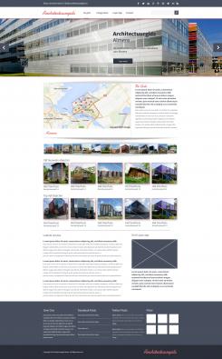
Digital Architectural Guide Almere
Contest details:
Silver
- Contest holder: D-Byte
- Category: Website design
- Total budget: € 599.00
- Start date : 11-06-2015 01:08
- Ending date : 08-07-2015 00:57
- Status : Ended
- Required formats: psd,ai,
- Relevant files: None
-
Available languages:


- Number of designs: 16
-
Response rate:
low high
Needs:
The website is a database of architecture, urbanism and landscape in Almere. The appearance and style of the website are currently based on the style and form of the
paperback guide Almere architecture, 2nd edition, Pharos Publishers, ISBN 978-90-79399-
21-5. All objects in the database can also be viewed via the app Layar https://www.layar.com/layers/almerepoortlayer, so you walk or cycle through Almere, so that you can experience the architectural and landscape qualities. An example of a part of the book is attached as a pdf.
Criteria:
The new style of the web site does not have to be in line with the book. We are looking for a sleek design that looks and fits in with modern architecture. It will be an added value if there is something typical of Almere in the design. The website must be available for all screen types (PC, mobile, tablet) (responsive design), we'd like to see again that in the design. The design supports the content that we want to communicate and not dominated them. The presentation of the design is illustrated by explaining the choices made. The website is based on Drupal 7. For the winner there is space on the website in the foot for a logo with a link to your own page.
Company description:
The guide Almere architecture was created by Casla, the former Centre for Architecture, Urbanism and Landscape of Almere. The guide is now part of Kunstlinie Almere, Flevoland, the new core cluster culture of the city.
Target group:
Anyone interested in architecture, urbanism and landscape in Almere. Navigation should be clear because the target audience is very broad.
Colors, favourites and other requirements
Colors should not be primary, not too hard or as now in paperback based on the basic Pantone colors
Abyss27
-
-
Description by designer Abyss27:
Hierbij mijn ontwerp. Een strak ontwerp. Duidelijk en overzichtelijk. Dit is een weergave van de homepagina.
-
D-Byte says :
Really nice feel and colour in this design. Maybe the header font is to lose.
-
Abyss27 says
What do you mean exactly, what would you like to see differently. I can change the font or its placement, or even add something behind it
-
Abyss27 says
What do you mean exactly, what would you like to see differently. I can change the font or its placement, or even add something behind it
-
Abyss27 says
What do you mean exactly, what would you like to see differently. I can change the font or its placement, or even add something behind it
-
D-Byte says :
I mean the handwriting font does not work for this design. For the rest its a really nice design.
-
Abyss27 says
Sorry about the repeating messages. Ok I understand what you mean
-
This contest is finished. Its not possible to reply anymore.
-

