Vladimir Stamenkovic, (Co-) Owner of Chamber "SH Rechtsanwälte" (Lawyers).
Contest details:
Gold
- Contest holder: Stamenkovic
- Category: Website design
- Total budget: € 799.00
- Start date : 26-02-2013 17:13
- Ending date : 17-03-2013 17:03
- Status : Ended
- Required formats: jpg,psd,
- Relevant files: None
-
Available languages:


- Number of designs: 9
-
Response rate:
low high
Needs:
Hello you all,
we want to have a new and fresh Internet presence, check out: www.rae-sh.com !
You should use our logo !
The next few days we will take some pictures of the team + in- and outside of our office.
The design should NOT be like the typical website of other law offices.
We also welcome special/different and innovative design ideas.
Important to us is a contact-icon, contact-field, something like that. You should reach that one easily from every site.
We also want to extend our navigation menu.
For example:
main menu: Rechtsgebiete (branch of law)
submenus (left field under the logo of the current website): Allgemeines Zivilrecht (general civil law), Anwaltliches Forderungsinkasso, Arbeitsrecht, Bankrecht, etc...
Here we want: If you klick for exp. on the submenu "Bankrecht" that even more submenus open, like "Recht & Info, Urteile, Aktuelle Fälle" (I think it's called - "Fly-Out-Navipoint).
Because we are a law office the interest of information of our visitors is really big, that means: Internet presence should not just have nice pictures, etc, also it needs to have a lot of TEXT.
In my opinion the ease of reading/handeling on our current site isn't that good.
Here is actually a lot of potential for improvement.
The right site of the website also should be able to be filled with more information, for example "News/Aktuelles" (atm we just have an contact-icon there).
I'm looking forward to your ideas and improvements.
Greetings from Essen!
Vladimir Stamenkovic
Company description:
"SH Rechtsanwälte" (Lawyers) is a law office.
Target group:
People who have questions about something of the law.
Colors, favourites and other requirements
All requirements we already have said. You also should use our "officeblue" which is used in our logo.
TeeM
-
-
Description by designer TeeM:
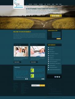
I made this entry with testimony and new block variation.
thanks. -
This contest is finished. Its not possible to reply anymore.
-
-
-
Description by designer TeeM:
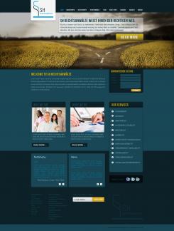
I made another layout variation
Thanks. -
This contest is finished. Its not possible to reply anymore.
-
-
-
Description by designer TeeM:
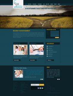
I hope You will like this, and Your feedback will be appreciate.
thanks.
TeeM -
This contest is finished. Its not possible to reply anymore.
-


