Web Page Development for FOSTER CARE CENTRE FOR CHILDREN AND YOUTH BELGRADE
Contest details:
- Contest holder: hraniteljstvocps
- Category: Website design
- Total budget: € 350.00
- Start date : 01-08-2012 10:53
- Ending date : 31-08-2012 10:30
- Status : Ended
- Required formats: psd,
- Relevant files: None
-
Available languages:


- Number of designs: 21
-
Response rate:
low high
Needs:
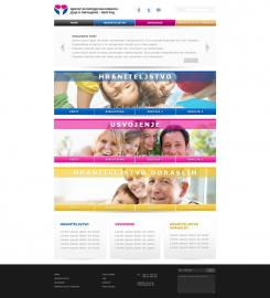
In the attachment you have the basic wireframes and the concept of the home page and other pages. The web page should be professional on one side but to also (with lively colors) bring out the child in the visitor.
Focus is more on web 2.o styles with bigger spacing's and headers. The idea is for the home page to be the holder of everything most important that the Centre is doing. That is why it is divided in 3 main categories. The header`s of the pages should include the images of the Centres main focus and occupation so you can freely try with images of children playing in park , celebrating etc. Footer is at this moment split in 3 parts, and the only reason is that there are 3 main categories. If you have any idea how to expand that , be creative!
As for the color of the pages, at the moment we need home page, news page (first combination of colors) page with single news (second combination of colors)and the page with the basic form for contacting and sidebar (third combination of colors). Of course if you wish you can always give us ideas with more pages if it will complete your full concept.
You can find the basic wireframes here : http://d.pr/f/BV8m.
-------------------------------------------------------------------------------
Additional: Center logo examples - http://d.pr/f/lZBD
Company description:
FOSTER CARE CENTRE FOR CHILDREN AND YOUTH BELGRADE.
Centre has 3 main activities, Foster care for children and youth, adoption and elderly care.
Target group:
This is not that easy to define. More and more people with different age is getting interested for the Centre. With this information you should keep in mind that the web page should not contain any offensive images or colors to any religious or national group. Also , the combination of colors or images should not be favoring any nation or religious group.
Colors, favourites and other requirements
The current web page can be previewed here : http://www.hraniteljstvocps.gov.rs/latinica/index.htm.
As for colors, they are stated in the basic ideas (blue for foster care, pink for adoption, dark yellow for elderly foster care.)
Of course if you have any other ideas, please give us your choice we are open to any suggestions.
logotweek
-
-
Description by designer logotweek:
Pocetna strana. Unapred hvala na komentarima.
Pozdrav, Sandra -
hraniteljstvocps says :
Izvinjavam se na malom kasnjenju u odgovoru.
Prvo zelim da se zahvalim na radu.
Kompozicija iz wf-a je definitivno tu, medjutim, na neki nacin je taj centralni deo "prazan".
Mozda ukoliko bi se ove velike slike zamenile, ili na neki nacin prilagodile celom konceptu.
Nisam konkretno siguran na koji nacin promeniti centralni deo da mu se da malo zivosti...
Ali u globalu osnovne smernice su tu.
Pozdrav,
Nemanja -
This contest is finished. Its not possible to reply anymore.
-

