Website design KernCompany
Contest details:
Silver
- Contest holder: KC
- Category: Website design
- Total budget: € 599.00
- Start date : 05-01-2014 18:48
- Ending date : 29-01-2014 18:42
- Status : Ended
- Required formats: jpg,psd,
- Relevant files: None
-
Available languages:


- Number of designs: 14
-
Response rate:
low high
Needs:
We describe our charisma, or image so you want, as ‘feminine kingship/royalty’. For we perform masculine approaches (sharp, strong, result driven, to-the-point) wrapped in feminine qualities (empathic, warm, compassionate).
Our former designer already designed the navigationbar. This design is final and to be used in the header of every page of our website (see example). In the attached example a yellow background is applied. This is not the colour we want, it is too deep/strong, we want a lighter colour (we believe is more neutral) with a bit of sparkling, like gold.
Our company colours are: purple (deep accent colour), red (deep accent colour), gold (principal colour).
In line with with our image, we believe the lines used in the layout of our websitepages should be waving/curving lines that appear fluent in the eyes of the beholder (=vistors of our website).
Another essential part of our website design is to be a visual component (e.g. button or banner) that appears on every page and communicates the ‘heart’ of our work/company, namely ‘Relatieverbeteraars’ (in English: relationship improvers). In every training/course/coaching we employ ‘relationship improvement’ as our basis principle. So also in all our company’s expressions, e.g. website, we want ‘Relatieverbeteraars’ to appear as main feature.
To give you an impression of how the Kerncompany appears on the market, we also attached an copy of our most recent advertisement. We very much like the look of it and we already received complimentary responses.
Company description:
KernCompany specializes in training, coaching and specific therapy of (private) individuals, teams, groups and companies (profit and non-profit). We focus on the heart of the matters (english translation for ‘Kern’ = core, essence, heart) we deal with. Relationship improvement is the basic principle we work by.
It is our passion and mission to make a real difference for the people and organizations we work with. We do so by training, consultancy, constellations, coaching and supervision. We challenge people to see things differently and break through old patterns so they enable themselves to achieve their goals, without excluding anything that matters or blocks them to do so.
TARGET GROUP
Our main targetgroup is business, companies and organizations, profit and non-profit. Secundairly we aim at individuals (personal development).
Target group:
Our main targetgroup is business, companies and organizations, profit and non-profit. Secundairly we aim at individuals (personal development).
Colors, favourites and other requirements
Our company colours are: purple (deep accent colour), red (deep accent colour), gold (principal colour).
We are very charmed by the landingspage of www.marjolein-engbers.nl. At first sight only pictures, only after clicking you enter the site.
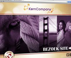
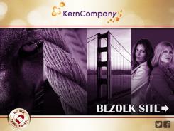
Images of totem animals would also please us. We haven’t yet found the most appealing images, but we have in mind: horse, tiger/lion. More images we like you find as attachements: Image 1: totem animal lion, Image 2: connection rope, Image 3: connection bridge
JelleSmid
-
-
No comments
-
This contest is finished. Its not possible to reply anymore.
-
-
-
No comments
-
This contest is finished. Its not possible to reply anymore.
-


