 Nederland
 België
 France
 Deutschland
 Österreich
 International
No comments
develop a brochure for a new vintage, furniture/lifestyle shop
- Contest holder: vintagefurniture
- Category: Flyer, tickets
- Status: Ended
Start date: 19-06-2014
Ending date: 02-07-2014
Total budget: € 150.00
Latest design
It all started with an idea...
A short, interactive guide helped them discover their design style and clearly captured what they needed.
Brandsupply is a platform where creative professionals and businesses collaborate on unique projects and designs.
Clients looking for a new logo or brand identity describe what they need. Designers can then participate in the project via Brandsupply by submitting one or more designs. In the end, the client chooses the design they like best.
Costs vary depending on the type of project — from €169 for a business or project name to €539 for a complete website. The client decides how much they want to pay for the entire project.
Designer:
 WalidGraphix
This contest is finished. Its not possible to reply anymore.
No comments
The back side.
This contest is finished. Its not possible to reply anymore.
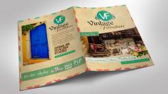
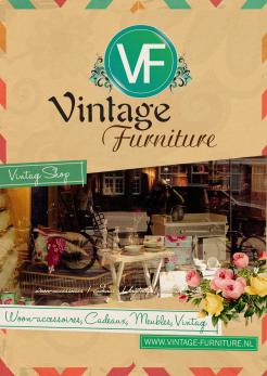
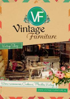
This is a preview of the brochure after printing.
Hi Walid,
It looks quite different but I like it. How about the texts. I can send them to you and then you can copy them exactly as they are in the brochure?
Yes, you send me the text you want, and I'll copy it instead of the random text.
This contest is finished. Its not possible to reply anymore.
No comments
This contest is finished. Its not possible to reply anymore.
No comments
This contest is finished. Its not possible to reply anymore.
Hi! Changing about color is done.
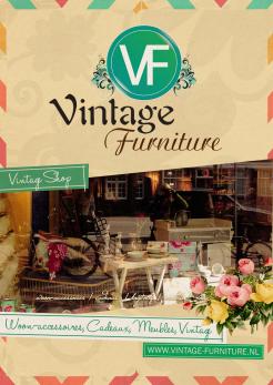
The front page is not what I had in mind. It is too busy with the flowers en the big brown upper part. Flowers can be used but then it should be the PiP Studio flower type (the brand we carry).
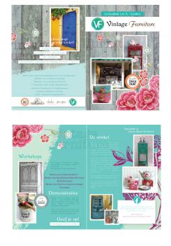
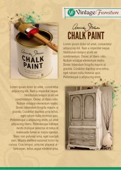
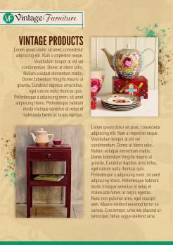
The flowers are just decorative, and don't refer to any brand. I had as a plan to show the shop in the front page, to talk about vintage products in the 2nd page, about chalk paint in the 3rd page, and finally about all the brands you carry, your adresse and your telephone number in the last page. What do you think ?
This contest is finished. Its not possible to reply anymore.
3rd side.
Thank you Walid
I like the design. Only the color is too browny. I prefer a much lighter appearance
Is that possible?
This contest is finished. Its not possible to reply anymore.
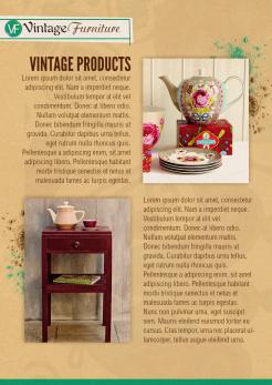
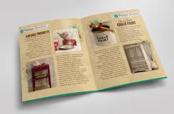
A proposition for the 2nd side.
I chosen this wood yellow (like for the 1st side) because it symbolizes the Vintage Style, and reminds wood (that's used at houses and workshops). I set also some paint splatters behind the photo because they make you think about painting at workshops ...
The texts are random, you can ask me to change them by anything you want.
I chosen to show in the 2nd side the general Vintage products, and the Chalk Paint in the 3rd side.
This contest is finished. Its not possible to reply anymore.
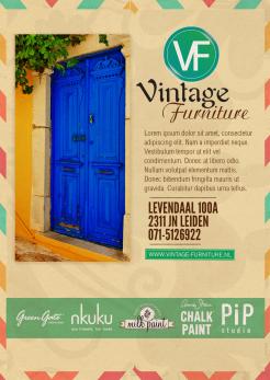
A new version of the 1st side with a slight black ornament in the background.
This contest is finished. Its not possible to reply anymore.
Hi! Here's my proposition for the 1st side.
As you see, I used colors, fonts, forms and textures that refer to the vintage style, and especially to have a feminine feeling. I tried to show the products of the shop through the window. The texts are random, you can ask for any changement.
Best regards, Walid.
This contest is finished. Its not possible to reply anymore.