 Nederland
 België
 France
 Deutschland
 Österreich
 International
No comments
Basti a cute donkey
- Contest holder: i-mondi
- Category: Illustration, drawing, fashion print
- Status: Ended
Start date: 27-05-2013
Ending date: 07-06-2013
Total budget: € 349.00
Latest design
It all started with an idea...
A short, interactive guide helped them discover their design style and clearly captured what they needed.
Brandsupply is a platform where creative professionals and businesses collaborate on unique projects and designs.
Clients looking for a new logo or brand identity describe what they need. Designers can then participate in the project via Brandsupply by submitting one or more designs. In the end, the client chooses the design they like best.
Costs vary depending on the type of project — from €169 for a business or project name to €539 for a complete website. The client decides how much they want to pay for the entire project.
Designer:
 Esther
Thanks for the appreciation! If you want to see changes let me know.
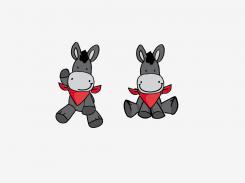
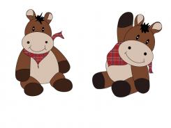
I like this one very much. But
(Left donkey)
1.the scarf ist a little too big and it looks stiff
2. the belly is aaaa little to big
(right donkey)
1. Frontview: is just too fat I guess it's probably again the belly
2. Scarf looks too pointed on the tip
I'll be a week out of office when I come back - more.
This contest is finished. Its not possible to reply anymore.
No comments
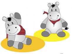
The frontview of the boody is here a little better, but the legs have some problem
This contest is finished. Its not possible to reply anymore.
grey
This contest is finished. Its not possible to reply anymore.
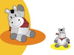
Basti without cellulitis and with scarf. Grey will follow
I guess what I looks strange to me is the left side of the front view:
1. I think you tried to make a knee but then there is no thigh, because the hand is over it. The left side of his body looks like a straight line from his shooulders to his leg. Please also checkout the nostrils of the frontview - they are maybe a little to separated, maybe because the smile is smaller. I don't know. Please check it I'm sure you will find the reason. :-)
This contest is finished. Its not possible to reply anymore.
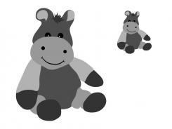
grey
It has no scarf. My problem is here it's to dark, it has It has cellulitis on the legs and arms :-)
Hahaha, I make the cellulittis tighter, add the scarf and make it lighter
This contest is finished. Its not possible to reply anymore.
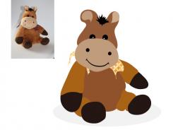
Best i-mondi,
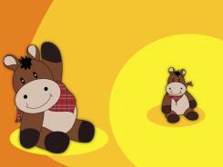
Here a proposal for a new look for Basti.
Drawned from one of the photo's.
Ill hope you like it
Greets Esther
Hmm brown looks not bad - Bad the background on the header-card ist Orange probably this will make problems
This contest is finished. Its not possible to reply anymore.