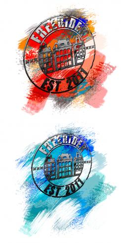
Version III (personaly my favorite)
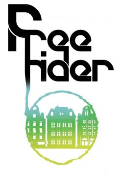
Its all about the colors! From serious logo comes out a rainbow of posibilities! If everything would be rainbow-colored, it wouldn't have that district and serious look. Sharp edges of lettering makes it serious, and curves between give us the sense of TRUST. The blue drop has the same effect. It is elegant and dives into the logo that is the essense.
If some changes are needed for the logo, it's possible to repair, because I still have .psd file.
CutEdgeArt
Clothing
- Contest holder: Freerider
- Category: Illustration, drawing, fashion print
- Status: Ended
- Files: File 1, File 2, File 3
Start date: 09-03-2012
Ending date: 23-03-2012
It all started with an idea...
A short, interactive guide helped them discover their design style and clearly captured what they needed.
Brandsupply is a platform where creative professionals and businesses collaborate on unique projects and designs.
Clients looking for a new logo or brand identity describe what they need. Designers can then participate in the project via Brandsupply by submitting one or more designs. In the end, the client chooses the design they like best.
Costs vary depending on the type of project — from €169 for a business or project name to €539 for a complete website. The client decides how much they want to pay for the entire project.
Version II
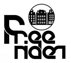
Simple black logo. The sign is in the right relation with the big "F".
Dott in the centre gives a little playfull spirit to the letter-logo.
If some changes are needed for the logo, it's possible to repair, because I still have .psd file.
CutEdgeArt
No comments
Version I
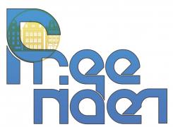
Blue and yellow are one of the three main colors. By combining them with the letter and logo, we get green color. It is the product of the begining, of the base. It can represent new relevation.
Two little "r" letters give a nice closure to the second word. They make a nice frame that circles the logo.
If some changes are needed for the logo, it's possible to repair, because I still have .psd file.
CutEdgeArt
 Nederland
 België
 France
 Deutschland
 Österreich
 International


