 Nederland
 België
 France
 Deutschland
 Österreich
 International
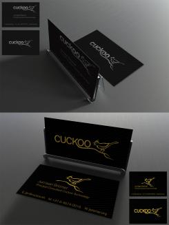
Update for previously uploaded golden foil card.
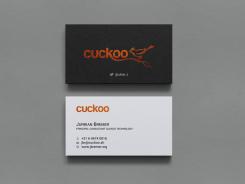
Cuckoo Sandbox
- Contest holder: jbremer
- Category: Illustration, drawing, fashion print
- Status: Ended
- Files: File 1, File 2
Start date: 30-05-2015
Ending date: 27-06-2015
Total budget: € 279.00
Latest design
It all started with an idea...
A short, interactive guide helped them discover their design style and clearly captured what they needed.
Brandsupply is a platform where creative professionals and businesses collaborate on unique projects and designs.
Clients looking for a new logo or brand identity describe what they need. Designers can then participate in the project via Brandsupply by submitting one or more designs. In the end, the client chooses the design they like best.
Costs vary depending on the type of project — from €169 for a business or project name to €539 for a complete website. The client decides how much they want to pay for the entire project.
Designer:
 hypdesign
I like it - nice and simple :)
This contest is finished. Its not possible to reply anymore.
One more option to reconsider - went through your web site a little, so I figured....
I get your motivation behind this design, and it's nice, but it doesn't really work on my target audience which may not be always 100% technical.
No problem, just a thought. :)
This contest is finished. Its not possible to reply anymore.
No comments
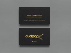
Reworked the layout a little. Bird "fill" and long title is now back.
Definitely potential in this one! :)
Hi Hypdesign,
Nice design! It is a shame that's it's look like mine.
Good luck with the contest.
Toobe.art - Beatrice
?
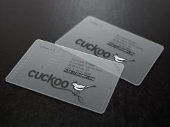
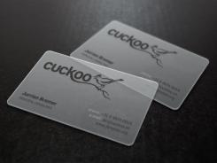
This transparent card mock up is available to everyone, not sure what you mean.
http://graphicburger.com/translucent-business-cards-mockup/
This contest is finished. Its not possible to reply anymore.
No comments
I do like this gold color, though ;)
This contest is finished. Its not possible to reply anymore.
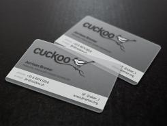
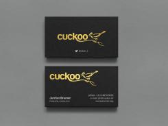
A few more options, silver and gold foil.
Silver is not really my color.
This contest is finished. Its not possible to reply anymore.
No comments
This one is pretty cool (as the other transparant one). But I do still feel more for the other one for the following reasons: the non-transparant bird, partial job title (although the Cuckoo logo sort of makes up for that, but still), maybe would make more sense if the phone/email/site was more consistent/aligned? And you got my name wrong, but that's just a small fix away ;)
Ah, yes. Sorry about that. Will be fixed :)
This contest is finished. Its not possible to reply anymore.
No comments
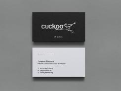
The cuckoo text on the back is not very well readable, I think? The layout of the rest is quite okay, though.
This contest is finished. Its not possible to reply anymore.
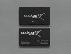
Here is copper and silver foil option.
Would probably have to see the real version to decide - I'm a little bit afraid it doesn't express a professional attitude.
This contest is finished. Its not possible to reply anymore.