 Nederland
 België
 France
 Deutschland
 Österreich
 International
Dag Jurriaan,
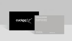
Dank voor de feedback. We houden er van ongecompliceerde visuals te gebruiken, dat straalt rust en professionaliteit uit. Hierbij een tweede voorstel. Zoals je ziet doet een kleine aanpassing heel veel.
Deze stijl is ook direct mooi door te voeren op andere platformen, mocht dat later gewenst zijn. Zo ontstaat een heel krachtige huisstijl.
Vriendelijke groet,
Dylan — Studio Sust.
Cuckoo Sandbox
- Contest holder: jbremer
- Category: Illustration, drawing, fashion print
- Status: Ended
- Files: File 1, File 2
Start date: 30-05-2015
Ending date: 27-06-2015
Total budget: € 279.00
Latest design
It all started with an idea...
A short, interactive guide helped them discover their design style and clearly captured what they needed.
Brandsupply is a platform where creative professionals and businesses collaborate on unique projects and designs.
Clients looking for a new logo or brand identity describe what they need. Designers can then participate in the project via Brandsupply by submitting one or more designs. In the end, the client chooses the design they like best.
Costs vary depending on the type of project — from €169 for a business or project name to €539 for a complete website. The client decides how much they want to pay for the entire project.
Designer:
 studiosust
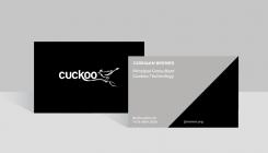
Linksboven en linksonder aan de achterkant staan opzich wel prima zo, maar jbremer.org valt een beetje in 't niets en die streep doet me niet zo heel veel.
This contest is finished. Its not possible to reply anymore.
Dag Jurriaan,
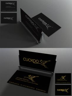
Hierbij ons eerste ontwerp. Het metallic effect is iets dat in het print process pas ter pas komt en zou met dit ontwerp heel gaaf staan op de voorkant van het kaartje, waar het logo in metallic wordt gedrukt.
We zijn erg benieuwd naar je reactie.
Met vriendelijke groet,
Dylan — Studio Sust.
Beste Dylan,
De voorkant is simpel maar doeltreffend. Achterkant vind ik wel wat basic ;)
This contest is finished. Its not possible to reply anymore.