 Nederland
 België
 France
 Deutschland
 Österreich
 International
No comments
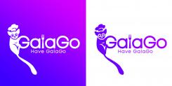
Designers Champions League design for start up
- Contest holder: GalaGo
- Category: Illustration, drawing, fashion print
- Status: Ended
- Files: File 1
Start date: 02-12-2021
Ending date: 09-12-2021
Total budget: € 369.00
Latest design
It all started with an idea...
A short, interactive guide helped them discover their design style and clearly captured what they needed.
Brandsupply is a platform where creative professionals and businesses collaborate on unique projects and designs.
Clients looking for a new logo or brand identity describe what they need. Designers can then participate in the project via Brandsupply by submitting one or more designs. In the end, the client chooses the design they like best.
Costs vary depending on the type of project — from €169 for a business or project name to €539 for a complete website. The client decides how much they want to pay for the entire project.
Designer:
 KPS
KPS
This contest is finished. Its not possible to reply anymore.
No comments
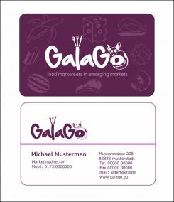
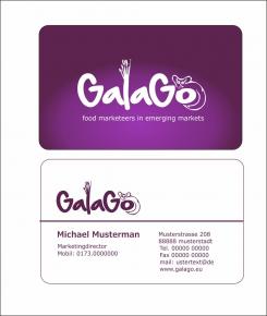
Hier Versuch mit Galago mittig in Schrift integriert mit Besteckkrone! Bin gesoannt wie es gefällt.
Here experiment with Galago integrated in the middle in writing with cutlery crown! I am known as I like it.
This contest is finished. Its not possible to reply anymore.
No comments
This contest is finished. Its not possible to reply anymore.
No comments
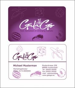
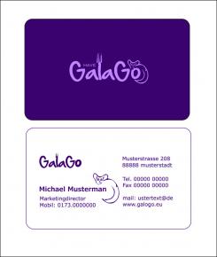
Here with the first small changes.
Hier mit ersten kleinen Änderungen.
This contest is finished. Its not possible to reply anymore.
No comments
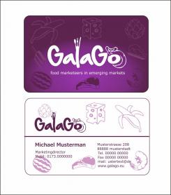
Feedback welcome! Thanks
Hello and thank you for your design. We have received quite a few designs in short time already, and are in the phase of selecting the best. Your design is amongst them, and tastes like more.
I called this the Champions League for a reason. I will need the very best design for this project, and looking for the Ronaldo in you as a designer. Besides, GalaGo has a policy to never take satisfaction with a first design, because we are confident that you will have more in you to impress us, and we would like to see it.
This is the honest feedback I can give to you, and hope it will be useful to you and motivate you. The first time I looked at it was in small format on my phone and somewhat in a rush, it didn't immediately catch me like the other designs which seem more basic than this one, and 'easy to keep in mind'. Taking my time on the laptop later, and studying the front logo a few seconds longer and closer, I still think it is less recognizable than others, but
actually do like it a lot and is among my personal favorites. It differs from other designs in positive way, the fork, the animal, the 'have', there is definitely a story told in it. I do think the animal should be placed on the 'o' at all times, in my opinion the name 'GalaGo' on the backside looks a bit incomplete without it.
Most designs we liked include a fork since they have all received the suggestion to create a link with food as well. We can see you are sharp as a knife, and either realized or noticed this already.
But like said, we have given the fork as an example only. If you think you have a better idea to link the logo with food in any other way, we will welcome any personal inspiration. In fact, we would love it. I came up with the fork in seconds to give an example only. We represent all food brands and companies so cheese, chocolate, fish, bakery, fresh produce, use your imagination although we do really like this particular fork in this design as well.
The font was like looking at the logo for the first time. Not sure at first, but impressed in second opinion. It is catchy, readable without being an average all-day font. Maybe a bit more fatness could make it a bit more clear from distance or at first sight. I also like to see this one with the text line below: Food Marketeers in Emerging Markets.
Compliments for your work so far, we definitely see the potential Ronaldo in your designer skills. Impress us.
Thanks for your constructive Feedback!
Thanks for your constructive Feedback!
Here with the first small changes.
This contest is finished. Its not possible to reply anymore.