 Nederland
 België
 France
 Deutschland
 Österreich
 International
No comments
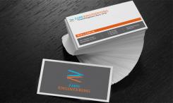
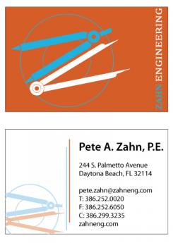
Engineering firm looking for cool, professional business card design
- Contest holder: kevin xD
- Category: Illustration, drawing, fashion print
- Status: Ended
- Files: File 1, File 2, File 3
Start date: 24-02-2016
Ending date: 02-03-2016
Total budget: € 279.00
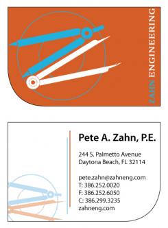
Latest design
It all started with an idea...
A short, interactive guide helped them discover their design style and clearly captured what they needed.
Brandsupply is a platform where creative professionals and businesses collaborate on unique projects and designs.
Clients looking for a new logo or brand identity describe what they need. Designers can then participate in the project via Brandsupply by submitting one or more designs. In the end, the client chooses the design they like best.
Costs vary depending on the type of project — from €169 for a business or project name to €539 for a complete website. The client decides how much they want to pay for the entire project.
Designer:
 UncleTee
This contest is finished. Its not possible to reply anymore.
Hi Kevin,
As requested, the designs without cut-off logo's. Hope you like it!
kind regards, Terry
PS. If you do choose to pick my design, could you send me the original design files for your logo? This way I can make sure the lines are nice and crisp, and the colours match the original design 100%. Thanks in advance!
This contest is finished. Its not possible to reply anymore.
No comments
This contest is finished. Its not possible to reply anymore.
No comments
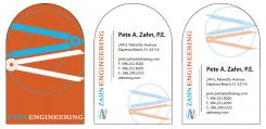
Remove the one on the bottom left of the card. Not the one from the top.
This contest is finished. Its not possible to reply anymore.
No comments
This contest is finished. Its not possible to reply anymore.
No comments
This contest is finished. Its not possible to reply anymore.
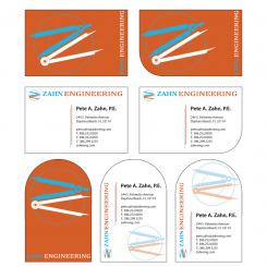
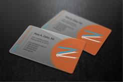
here's a version on translucent pvc. I chose a one-sided design, because using both sides would mean both designs would be visible on both sides, which would interfere with each other and cause an unreadable business card. With this design, this would be avoided. Hope you like it!
kind regards, Terry
Great this version, but you need to fit the entire logo on it. Thanks.
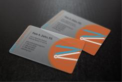
Fixed that for you, hope you like it!
This contest is finished. Its not possible to reply anymore.
No comments
This contest is finished. Its not possible to reply anymore.
No comments
This contest is finished. Its not possible to reply anymore.
No comments
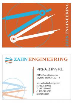
Great graphic work. I'd like to see a bit more variety on the material and shape.
So far this is my favorite design, would like to see it in other versions. Thank you.
Thanks for the compliment! I'm working on some variations right now, I'll send you some asap!
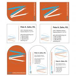
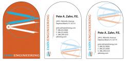
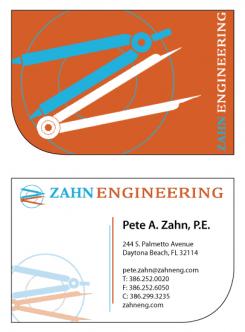
Could you shrink the logo a little to fit entirely on the backside of the card? And remove the logo on the front? Thanks.
I would prefer to see a larger version of the logo on the back side of the card.
Sure, no problem. Just to be clear: do you want the logo on the "orange" side to be smaller to fit, and the logo on the adress side gone? And by gone do you mean the top one or the one on the side? thanks
I like your designs. One comment. When you put the logo on the card, I would prefer that no part of the 2 compasses that form the "Z" are cut off. The 2 compasses should be completely displayed. Thanks.
Remove the one on the bottom left of the card. Not the one from the top.
This contest is finished. Its not possible to reply anymore.