 Nederland
 België
 France
 Deutschland
 Österreich
 International
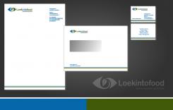
An example of a house-style.
looking for logo (for use on business card & website) for my company (www.loekintofood.com)
- Contest holder: Loekintofood
- Category: Illustration, drawing, fashion print
- Status: Ended
Start date: 25-03-2017
Ending date: 20-04-2017
Total budget: € 129.00
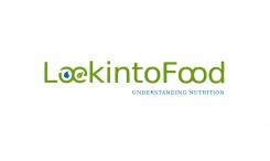
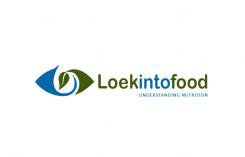
Latest design
It all started with an idea...
A short, interactive guide helped them discover their design style and clearly captured what they needed.
Brandsupply is a platform where creative professionals and businesses collaborate on unique projects and designs.
Clients looking for a new logo or brand identity describe what they need. Designers can then participate in the project via Brandsupply by submitting one or more designs. In the end, the client chooses the design they like best.
Costs vary depending on the type of project — from €169 for a business or project name to €539 for a complete website. The client decides how much they want to pay for the entire project.
Designer:
 joosttilburg
This contest is finished. Its not possible to reply anymore.
No comments
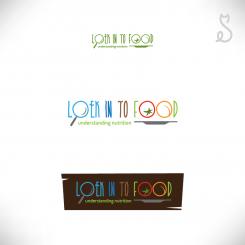
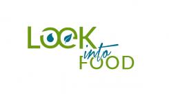
nice, subtle, the O and E - don't know if to subtle.. To make clear further that it can be loek into food, but also looking (in)to food, perhaps separate in from to
This contest is finished. Its not possible to reply anymore.
Thanks for your comment and rating.
Enclosed you'll find an other idea.
Nice! I am thinking though it is now kind of "marine" and "agri" - not so clear it has to do with food..
To make clear further that it can be loek into food, but also looking (in)to food, perhaps separate 'in' from 'to'
This contest is finished. Its not possible to reply anymore.
No comments
really good. Look/loek is well done. Could work more with the font maybe. Could make the drop blue and the leave green. And perhaps there is a way to show that loekintofood can be loek into food, but also looking to food. And "understanding nutrition" would be good to include
This contest is finished. Its not possible to reply anymore.
No comments
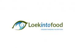
well-done: the eye like a leave. Could work more with the font maybe. So the eye is also a leave, and the blue inside is perhaps water? Latter is not so clear... And perhaps there is a way to show that loekintofood can be loek into food, but also looking to food. And "understanding nutrition" would be good to include
really good. Look/loek is well done. Could work more with the font maybe. And the leaf is also an eye, right? and the blue inside is water? nice, but could be clearer. And perhaps there is a way to show that loekintofood can be loek into food, but also looking to food. And "understanding nutrition" would be good to include
This contest is finished. Its not possible to reply anymore.