 Nederland
 België
 France
 Deutschland
 Österreich
 International
No comments
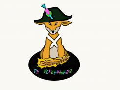
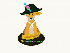
Mascot for animationteam
- Contest holder: Bovensluis
- Category: Illustration, drawing, fashion print
- Status: Ended
- Files: File 1, File 2, File 3
Start date: 25-03-2014
Ending date: 09-05-2014
Total budget: € 179.00
Latest design
It all started with an idea...
A short, interactive guide helped them discover their design style and clearly captured what they needed.
Brandsupply is a platform where creative professionals and businesses collaborate on unique projects and designs.
Clients looking for a new logo or brand identity describe what they need. Designers can then participate in the project via Brandsupply by submitting one or more designs. In the end, the client chooses the design they like best.
Costs vary depending on the type of project — from €169 for a business or project name to €539 for a complete website. The client decides how much they want to pay for the entire project.
Designer:
 AWLaan
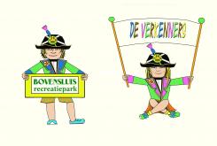
Beste AWLaan,
Hartelijk dank voor uw aangepaste ontwerp.
Qua kledingstijl vinden wij uw ontwerp goed aansluiten bij onze wensen (het oude fort/de Napoleon tijd). Helaas vinden wij uw tekenstijl iets te hoekerig. Wij geven de voorkeur aan meer vloeiende lijnen (als in de ontwerpen van BureauKomma, Mooiniet en Carina).
Met vriendelijke groet,
Recreatiepark Bovensluis
Ik beheers het tekenprogramma niet helemaal. Heb ideeën genoeg. Helaas.
This contest is finished. Its not possible to reply anymore.
No comments
This contest is finished. Its not possible to reply anymore.
No comments
Beste AWLaan,
Hartelijk dank voor uw ontwerp.
Met de hoed en het "kruis op de borst", zet u de juiste toon. Dit is de sfeer waar we naar op zoek zijn.
Helaas is deze manier van tekenen niet helemaal de stijl waar we naar op zoek zijn. Onze voorkeur gaat uit naar een "strakker" ontwerp (met duidelijke zwarte omlijning) zoals in de aangeleverde voorbeelden en in het design van BureauKomma.
Wij zien een eventueel aangepast ontwerp met belangstelling tegemoet.
Met vriendelijke groet,
Recreatiepark Bovensluis
This contest is finished. Its not possible to reply anymore.