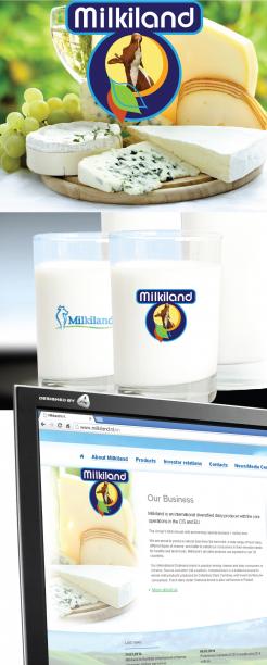
Look and convince yourself, the power of the form.
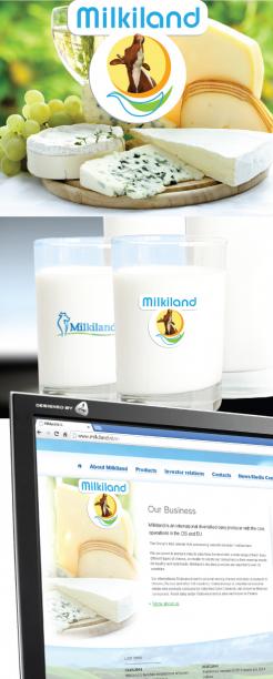
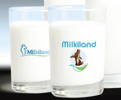
Redesign of the logo Milkiland. See the logo www.milkiland.nl"
- Contest holder: Yevhen
- Category: Logo design
- Status: Ended
Start date: 27-03-2014
Ending date: 25-04-2014
It all started with an idea...
A short, interactive guide helped them discover their design style and clearly captured what they needed.
Brandsupply is a platform where creative professionals and businesses collaborate on unique projects and designs.
Clients looking for a new logo or brand identity describe what they need. Designers can then participate in the project via Brandsupply by submitting one or more designs. In the end, the client chooses the design they like best.
Costs vary depending on the type of project — from €169 for a business or project name to €539 for a complete website. The client decides how much they want to pay for the entire project.
Thanks, the top shapes are here
The logos of the competitors are available here.
http://www.ex.ua/136742679474
or https://drive.google.com/file/d/0B3ra5RoWe4H1T1ducktpd2dMWGM/edit?usp=sharing
Our shape could be not like theirs.
What would you recommend?
Hi Yevhen,
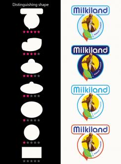
As I described earlier, I find the 5 star shape, my last entry, the strongest.
See links *****, this is the kind of Milkiland!
It is unique in shape and appearance.
4+
Ever thought it would be so difficult?
In this new entry, I've processed your main comments.
The oval shape is not the most distinctive shape as compared with the conqurentie.
Against it is my first submission the most distinctive form of all submissions in relation to the conqurentie.
Regardless of the name must at one point only by seeing the shape and the color a direct link with Milkiland.
There should be absolutely no relationship suggested, for example, "Arla" or "Milkana" just by the shape already!
Distinguishing feature, readability and radiance in relation to the product are the priorities in random order.
Given the time all of us remaining, I recommend you to react quickly to any changes that lead to the desired result.
Of course, minor adjustments can also be performed. Even after the competition
With creative greeting,
4+ (Harry)
No comments
Hello Yevhen,
You don't like the Cheese behind?
From 4 to 2 stars down...
Could you give me more feed back please.
4+
No comments
Hi,
It looks interesting.
Especially good is the font of Milkiland and the bottom with those leaves. The photo of the cow is questionable as it is completely for milk whereas we produce and sell much of cheese as well.
If you could think a little bit what to change in the middle of the logo it would be great.
Thanks,
Yevhen
Well Yevhen,
That's what I call a good rating, thank you.
There are a number of animals which produce milk which we use
for the dairy industry.
The cow is it still the most famous.
I think the cow remains and a cheese is added to the bottom or circle behind the cow.
What do you think of that idea?
Worked example follows In a minute.
With creative greeting,
4 +
Hi friend,
Cheese behind could be nice.
What I'm concerned is how to get all the elements together. I mean it has to look well against different package's backgrounds. When we do not have all included in one shape, have no margins, how could we use it? We need only white background then. That's not good. Please think of it.
 Nederland
 België
 France
 Deutschland
 Österreich
 International
