No comments
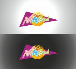
Redesign of the logo Milkiland. See the logo www.milkiland.nl"
- Contest holder: Yevhen
- Category: Logo design
- Status: Ended
Start date: 27-03-2014
Ending date: 25-04-2014
It all started with an idea...
A short, interactive guide helped them discover their design style and clearly captured what they needed.
Brandsupply is a platform where creative professionals and businesses collaborate on unique projects and designs.
Clients looking for a new logo or brand identity describe what they need. Designers can then participate in the project via Brandsupply by submitting one or more designs. In the end, the client chooses the design they like best.
Costs vary depending on the type of project — from €169 for a business or project name to €539 for a complete website. The client decides how much they want to pay for the entire project.
No comments
Without windmills please. The mill is not about milk and cheese and it's small. Large one we needn't either.
No comments
If we would make some adjustments after 26 of April. it would be great to have contacts
my mail is y.mulyarchuk@1inc.kiev.ua
the road wouldn't
vato@abv.bg
THANKS
No comments
If the road wouldn't get off to the horizon, maybe change the perspective
we like the shape, the font is a question. could be softer.
Anyway I see many versions, we'll think of them
No comments
I'm afraid we are not in the lie with competitors. They have got catchier colors. You have seen my file via the link, haven't you?
No comments
this is better
Hello
the upper one could be preferable.
Please write "Holland's premium" instead of just "premium"
And please compare the version with our competitors - Valio, Hochland, Arla, Milkana, Frico, President.
We should be as bright as they are.
Maybe you could adjust your colors.
The logoes of the competitors are avilable here.
http://www.ex.ua/136742679474
or https://drive.google.com/file/d/0B3ra5RoWe4H1T1ducktpd2dMWGM/edit?usp=sharing
Yevhen
Let's take only upper blue version
You could also try to change the color of milkiland (and Holland's premium), change to white or smth., change those filde stripes above to avoid a ripple feeling
thanks
 Nederland
 België
 France
 Deutschland
 Österreich
 International
