No comments
Design a logo for a dynamic event agency
- Contest holder: Teamazing
- Category: Logo design
- Status: Ended
Start date: 26-04-2014
Ending date: 10-05-2014
It all started with an idea...
A short, interactive guide helped them discover their design style and clearly captured what they needed.
Brandsupply is a platform where creative professionals and businesses collaborate on unique projects and designs.
Clients looking for a new logo or brand identity describe what they need. Designers can then participate in the project via Brandsupply by submitting one or more designs. In the end, the client chooses the design they like best.
Costs vary depending on the type of project — from €169 for a business or project name to €539 for a complete website. The client decides how much they want to pay for the entire project.
No comments
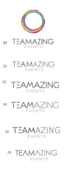
Do you want black letter for "TEAM" ?
Please consider our previous comment concerning the lettering. We would like to have only the "TEAM" bold but the whole lettering black
No comments
I don’t know the name of this font, so I have made this logo especially for you.
I hope I understood your request?
Our idea of the circle apparentely doesn´t work with this style of lines, so we should stick with the previous design.
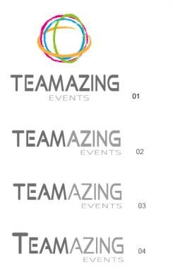
Lettering: The "T" of 05 is great, the rest of the lettering in 06 style, but also bold the "TEAM".
No comments
Hi,
I'm waiting for your coment. I hope that you prefer it.
thank you.
selenia
Dear selenia!
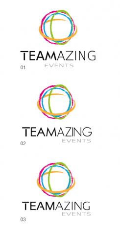
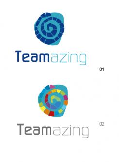
The icon is very good and one of our favourites. Maybe you also try to reduce the 3D-effect by turning the green and yellow circle that way to get a more circular look, instead of the spheric look.
Lettering: Try to do something like this:
http://images.brandsupply.com/design_logo-mattdesign-FbYwtTfs_245_170.jpg
But please draw through the letters "T", "E" and "M" and maybe the whole lettering a little bit thicker.
ok!
No comments
I'm waiting for your comment.thanks
Dear Selenia,
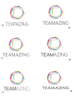
Thank you for those examples, we prefer something like 05. Can you also change the icon a little? We would like to see it in a more stronger way (try to make the lines a bit more thicker).
ok, thanks for the feeback!
No comments
Hello,
this is my second proposition.
I'm waiting for your coment. I hope that you prefer it.
Have a good day!
selenia
SELENIA
Dear Selenia,
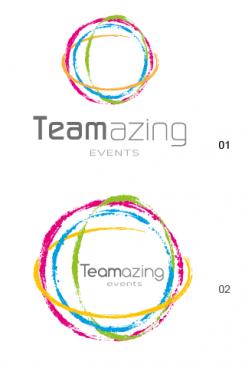
we really like your design proposition! Especially the one with teamazing underneath the circle. Maybe you can try for the name some different fonts (but similar)and Capital Latters. Thank you!
Maybe you can also try to shorten the circles a bit.
thanks!
 Nederland
 België
 France
 Deutschland
 Österreich
 International
