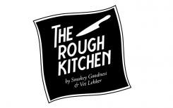
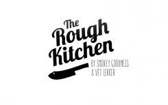
Logo for street food concept: The Rough Kitchen

Start date: 11-09-2014

Ending date: 29-09-2014

Total budget: € 329.00
Latest design
Book cover
Juancarlos

It all started with an idea...

A short, interactive guide helped them discover their design style and clearly captured what they needed.

Needs


Develop a logo for a new street food concept in the area of ​​meat. See below company description.

Key words: tough, rugged, robust, meat & fire, authenticity, butcher-lovers, from head to tail

Requirements:
* A logo with a powerful visual mark that expresses the essence of The Rough Kitchen
* Visual: Preferably not the clichés of pigs or cows (we also do other animals). Butcher tools again are possible but be creative, we are very much open to other creative images / visuals.
* Logo should be simple black / white and easy applicable in print. Also usable for napkins, textile etc. But also: lase metal.
* Logo is in addition used in other media outlets under the same label such as signing for the new position (s); The Rough Kitchen Magazine, The Rough Kitchen Cookbook, video / movies, and other media forms.

Company description


THE ROUGH KITCHEN is a concept of two carnivores in Heart & Soul. We grill and roast and smoke. On great fires. We alove for cows and pigs. Preferably from head to tail. We make out of them superior homemade 100% Aberdeen Angus burger and steak sandwich from bavette. Or our well known 16 hours slow cooked pulled porc sandwich made ​​from a pig from a nice backgrounds. From October 1, we have an indoor food stand on the new Food Halls Amsterdam.

The subtitle - by 'Smokey Goodness' and 'Vet Lekker'- refers to two partners with their own street food or catering concept who joined forces for this project under the new label The Rough Kitchen. See also: www.smokeygoodness and www.vetlekkerstreetfood.nl.

Target group


Visitors to food festivals, men (but also women) , urban, food lovers, meat lovers

Colors, favourites and other requirements


Please as soon as possible, within one week because of start project.

Take a look at enclosed documents to get an understanding for our look and feel.

Designer: Kate Kate
logo-kate-udkn4TTM

No comments

This contest is finished. Its not possible to reply anymore.
logo-kate-h2ktNAtE

No comments

This contest is finished. Its not possible to reply anymore.
logo-kate-BgyFkerA

No comments

Marcus PolmanMarcus Polman

Logo has a strong visual touch but it also screams murder / horror. Perhaps a bit less gruesome.

This contest is finished. Its not possible to reply anymore.
logo-kate-NpOS8sOO

No comments

Marcus PolmanMarcus Polman

Subtitle is to much part of the logo, instructions stated that this should be easily left out. We are missing the roughness, the box arround the text is not nice for embedding the logo on clothing etc. the font is to vinatagy.

Marcus PolmanMarcus Polman

Kijk vooral ook even goed naar de bijlage met voorbeelden. Vooral de eerste vinden we erg goed! Die van Gastronomie Fight Club…Succes!

This contest is finished. Its not possible to reply anymore.
logo-kate-C5LirCyG

No comments

Marcus PolmanMarcus Polman

lobster font is to round and misses roughness. Text now is leading, visual component should be more present.

KateKate

bedankt voor de feedback. ik ga ermee aan de slag.

This contest is finished. Its not possible to reply anymore.