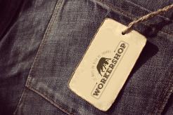
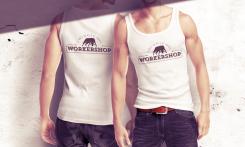
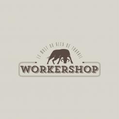
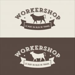
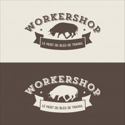
A rough and vintage logo for a store of unbreakable clothing:

Start date: 11-02-2015

Ending date: 31-03-2015

Total budget: € 329.00
Latest design
Book cover
arago24

It all started with an idea...

A short, interactive guide helped them discover their design style and clearly captured what they needed.

Needs


We wish a logo for men. It should represent highly-rated unbreakable of our clothes.

Company description


We are clothes dealers. But not any. We selected the brands which we distribute in store and on our site to supply in professionals one equipments worthy of the name.

There clothes are expensive. However their life cycle in extreme conditions make a thoughtful and profitable purchase. The luxury of the overalls in some kind.

Target group


At Workershop, we have friendly relationship with our customers. They are dirty and proud of the being! What we like it's to see them arriving with the clothes of the in tatters competitors and telling us: " I come to your place because my colleague told me that Workershop, it was of the heavy " brief of the men, between 25 and 45 years, rather brutish.

Colors, favourites and other requirements


our colors are black & red. But it's not an obligation to be in color.

Designer: plumegraphisme plumegraphisme
design_logo-plumegraphisme-Zh8dA9Wy

No comments

This contest is finished. Its not possible to reply anymore.
design_logo-plumegraphisme-g0kyak5o

No comments

crealogo88crealogo88

Trop beau, la corde fait la différence !
10/10 ;)

plumegraphismeplumegraphisme

;)

This contest is finished. Its not possible to reply anymore.
design_logo-plumegraphisme-AULR9jlY

No comments

This contest is finished. Its not possible to reply anymore.
design_logo-plumegraphisme-7QRRoJYu

No comments

This contest is finished. Its not possible to reply anymore.
design_logo-plumegraphisme-6o7j0R8q

No comments

This contest is finished. Its not possible to reply anymore.
design_logo-plumegraphisme-4Kqpmvaq

No comments

This contest is finished. Its not possible to reply anymore.
design_logo-plumegraphisme-G1KdJP4C

No comments

sequoiasequoia

beaucoup mieux, non?

plumegraphismeplumegraphisme

Oui, je préfère aussi !
Merci pour vos étoiles !

This contest is finished. Its not possible to reply anymore.
design_logo-plumegraphisme-eW7HnANU

No comments

sequoiasequoia

Joli logo, le taureau est sympa cependant il à l'air gras. peu être s'il se tenait droit, fier, muscle le message serait plus clair.

This contest is finished. Its not possible to reply anymore.
design_logo-plumegraphisme-z3IpbHqS

No comments

This contest is finished. Its not possible to reply anymore.
design_logo-plumegraphisme-yQz6nPSS

No comments

sequoiasequoia

je pense que vous avez bien compris l'esprit

This contest is finished. Its not possible to reply anymore.