No comments
Logo design for Fiboni.com
- Contest holder: Fiboni
- Category: Logo design
- Status: Ended
Start date: 11-06-2013
Ending date: 18-06-2013
It all started with an idea...
A short, interactive guide helped them discover their design style and clearly captured what they needed.
Brandsupply is a platform where creative professionals and businesses collaborate on unique projects and designs.
Clients looking for a new logo or brand identity describe what they need. Designers can then participate in the project via Brandsupply by submitting one or more designs. In the end, the client chooses the design they like best.
Costs vary depending on the type of project — from €169 for a business or project name to €539 for a complete website. The client decides how much they want to pay for the entire project.
Every color combination is possible so if you would like to see it in 3 colors, 1 color or .. just tell me what you would like to see.
I can also make a tumbnail for this one depending on the colors you would like to see.
I'm looking forward to your feedback
Greetings Sander
No comments
It's a nice logo, but it just feels too futuristic.
Thanks for the feedback !
i understand what you mean ,
here is another example.
I hope i get feedback on this one as well
Greetings !
Too Sci-fi
Ok thanks for the feedback,
And what about the other recent logo's ?
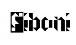
And this could be the 200 x 200 tumbnail. It's a logo you will never see because i made this font by myself. It's abstract , it's recognizable, it's simple & it's different.
As a thumb logo this fits better, however like I said in the previous reply its too abstract.
A pretty abstract font but i think it fits your website very well !
Greetings.
Sorry, it's too abstract. I am searching for something more "organic". Our site is mostly about nature like things. This would fit better in a other type of site. Nevertheless thanks for effort! Wkr
 Nederland
 België
 France
 Deutschland
 Österreich
 International
