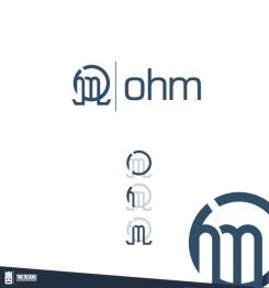
Here is how the ohm letter was formed.
A modern, yet simple and a bit play logo for a children's shoe brand.
- Contest holder: logo11
- Category: Logo design
- Status: Ended
- Files: File 1, File 2, File 3
Start date: 10-10-2016
Ending date: 17-10-2016
It all started with an idea...
A short, interactive guide helped them discover their design style and clearly captured what they needed.
Brandsupply is a platform where creative professionals and businesses collaborate on unique projects and designs.
Clients looking for a new logo or brand identity describe what they need. Designers can then participate in the project via Brandsupply by submitting one or more designs. In the end, the client chooses the design they like best.
Costs vary depending on the type of project — from €169 for a business or project name to €539 for a complete website. The client decides how much they want to pay for the entire project.
Wow, thanks for your explanation how it was formed.
Any ratings or revisions you want?
Dear Designer, Thank you for all the effort that you have made. Just now, we have selected a winner. It has been selected most close to our criteria…and the feeling it suits our brand the most. A message has been sent to Brandsupply to close the competition. Thank you again from the bottom of our hearts!
OHM letters
Hello, thanks for your effort!
Here are a few remarks:
-I like your ohm letters in the down right of that picture (ohm). I am still not quit sure of the logo next to it. It is from a different angle which is fantastic though. But...I am not quit sure with the way you put the o and m in that figure.
-where is the letter h? Or maybe I just can't see it. Apologies for this...
Looking forward to your reply. Thanks again!
Cheers
 Nederland
 België
 France
 Deutschland
 Österreich
 International


