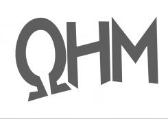
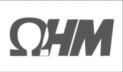
A modern, yet simple and a bit play logo for a children's shoe brand.

Start date: 10-10-2016

Ending date: 17-10-2016

Total budget: € 100.00
Latest design
Book cover
A4+

It all started with an idea...

A short, interactive guide helped them discover their design style and clearly captured what they needed.

Needs


Dear everyone,

Design a modern, simple and yet a little bit playful logo for a new Dutch children's shoe brand. My desire really goes for a modern, simple.....and yet a little bit playful kind of style. A 'simple' logo that we can use for: putting the brand logo in the shoe, the paper, the website etc. But also an easy logo to being able to remember.

Pro's:
-The logo must look fresh and new and inviting.
-The logo shall be used to put on the shoes and shall be used as a statement for everything to follow. Just a strong statement.

Background new company:
Name: OHM (this means resistance)
Style: a style that can be explained as Playful, Modern and Vintage.
Quality: High.
Price: is mid-high segment - which we would like to show to customers.

Advice: The Omega sign can be put into the logo. But this is not a must! See the enclosed attachments of the omega sign. This is just an example but definitely not necessary to use these examples. Please feel free to make it as modern, or whichever kind of logo you want. Because they are just examples and can be definitely better and nicer than the ones you see enclosed.

Please let your creativity go wild. Looking very much forward to your concept.

Thanks in advance!

Company description


<Dear everyone, we have found a winner. It has been a privilege in being able to work with such amazing talents from all over the world. Many thanks for all...and really...ALL your Great Efforts!! For us, as starters, such a website is just a true blessing. Again...thank you everybody!>


Dear everyone,

Design a modern, simple and yet a little bit playful logo for a new Dutch children's shoe brand. My desire really goes for a modern, simple.....and yet a little bit playful kind of style. A 'simple' logo that we can use for: putting the brand logo in the shoe, the paper, the website etc. But also an easy logo to being able to remember.

Pro's:
-The logo must look fresh and new and inviting.
-The logo shall be used to put on the shoes and shall be used as a statement for everything to follow. Just a strong statement.

Background new company:
Name: OHM (this means resistance)
Style: a style that can be explained as Playful, Modern and Vintage.
Quality: High.
Price: is mid-high segment - which we would like to show to customers.

Advice: The Omega sign can be put into the logo. But this is not a must! See the enclosed attachments of the omega sign. This is just an example but definitely not necessary to use these examples. Please feel free to make it as modern, or whichever kind of logo you want. Because they are just examples and can be definitely better and nicer than the ones you see enclosed.

Please let your creativity go wild. Looking very much forward to your concept.

Thanks in advance!

Warm regards!

Target group


Children

Colors, favourites and other requirements


Black or Dark Grey (Antracite)

But am open to other colours.

Designer: dimitry dimitry
logo-dimitry-GXMifKRk

No comments

logo11logo11

Thnx need some time to overthink this one.

logo11logo11

Thnx need some time to overthink this one.

logo11logo11

Dear Designer, Thank you for all the effort that you have made. Just now, we have selected a winner. It has been selected most close to our criteria…and the feeling it suits our brand the most. A message has been sent to Brandsupply to close the competition. Thank you again from the bottom of our hearts!

This contest is finished. Its not possible to reply anymore.
logo-dimitry-yc8lKt9c

No comments

logo11logo11

Hi Dimitri,
Thanks for your logo with changes!! Is it possible to put some shoes (in a modern way) on the foot of the Ohm sign? Take in mind they are children shoes (for boy and girl). But please don't use boy and girl shoe. Just a simpel shoe/ sock kind of way on the bottom of the O sign?

Just a though crossing my mind:)

This contest is finished. Its not possible to reply anymore.
logo-dimitry-ms623DjU

No comments

logo11logo11

This one I say no. Because in this country it is close to a daycare logo;) Sorry...but thanks for the effort once again:)

This contest is finished. Its not possible to reply anymore.
logo-dimitry-cMgkNJ9U

No comments

logo11logo11

Nope, too far. Sorry.

This contest is finished. Its not possible to reply anymore.
logo-dimitry-ugIAoIYi

No comments

logo11logo11

The ohm sign is playful...but not there yet.

This contest is finished. Its not possible to reply anymore.
logo-dimitry-CBO8t8UK

No comments

logo11logo11

Thanks for this design. Tbh..not close yet. It seems too businesslike. Sorry...
But thnx for this effort:)

This contest is finished. Its not possible to reply anymore.
logo-dimitry-mE1n6IAC

No comments

logo11logo11

Hi Dimitri, Thank you for your concept of OHM!

A few questions/ remarks:
-Can the colour be changed to dark grey/ antracite.
-It is still looks too business like? And a bit cold.
-What if you can put the omega sign differently?

Thanks again!
Cheers

dimitrydimitry

Of course i will change your remarks

logo11logo11

I need to take this logo in mind. For me, this is your closest one. Can you write children shoes in the down right of the logo? In a very small manner. Also tight, neat lettertype. Almost like Garamond.

This contest is finished. Its not possible to reply anymore.