No comments
Agilists
- Contest holder: Ruyter
- Category: Logo design
- Status: Ended
Start date: 08-02-2015
Ending date: 30-03-2015
It all started with an idea...
A short, interactive guide helped them discover their design style and clearly captured what they needed.
Brandsupply is a platform where creative professionals and businesses collaborate on unique projects and designs.
Clients looking for a new logo or brand identity describe what they need. Designers can then participate in the project via Brandsupply by submitting one or more designs. In the end, the client chooses the design they like best.
Costs vary depending on the type of project — from €169 for a business or project name to €539 for a complete website. The client decides how much they want to pay for the entire project.
No comments
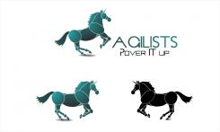
Like the swiftness of the animal. Agilists must have solid font and more profound. Power IT up is now in a too rounded font. Like IT being in a different color. See your other designs
No comments
Can you exxplain what you want to indicate with the symbol? I get a feeling of surfing.
Stylized A,
With the gap in the left side from the letter A,
That indicates the current state, while the other side is filled and shows progress
that goes to the empty area and wants to transfer innovation,
while the black arrow increases it because it goes through the upper red half of the center
towards the emptiness in a wide arc, which means comprehensiveness and unselfishly gives entire himself.
I followed the guidelines of principles " ROI" you specified in the description and what I later read.
Aggressive progress that does not hurt anyone and carries something good .
Best regards,
SonjaFilip
It's not to me it duplicated don't know why.
 Nederland
 België
 France
 Deutschland
 Österreich
 International
