Brisk logo for clean, white photography website

Start date: 21-01-2015

Ending date: 08-02-2015

Total budget: € 100.00
Latest design
Book cover
Sound

It all started with an idea...

A short, interactive guide helped them discover their design style and clearly captured what they needed.

Needs


Hi, my semi-professional hobby is photography. And my website is in desperate need of an update. An excellent opportunity to restyle the logo or to make an entirely new logo at the same time.
See the current website and logo on www.fotocv.nl

PS Only after choosing a logo , I'll continue with the website. I've seen a lot of websites to find out what I like, but found it harder to find examples of logos.

Company Name: Caroline van der Vecht Photography
Url: fotocv
The name and / or URL do not necessarily have to be a part of the logo.

The current logo contains green, I still like it, but I'm not married to it. But don't make it overly colourfull. Keep it stylish.
In combination with white and gray (not 50 shades!). Combination with earth tones or "gold" could work too. But it must remain brisk.
Clean , simple, timeless. No curls or frills. Not romantic or childlike , more professional and mature.

Company description


Although I mainly photograph horses, this does not have to be refelected in the logo

Target group


Colors, favourites and other requirements


To give you an idea of the websites I like or websites that contain elements I like:
https://www.fruute.com/
http://www.stanseatonphotography.co.uk/ but an bit too romantic, needs to be a bit more modern and lively
http://festamsterdam.nl/ nice logo, website could use some warmth and personal touches
http://www.nyckle.nl/index.html
http://www.balsamstudio.com/#main
http://www.pastoe.com/nl/9-collectie/cl
http://wootten.com.au/
http://intothedarkroom.com/blog/page/3/ some of these examples are a bit too romantic and soft
http://orchardkeepers.com.au/ just think it's original

Google fonts eg: Raleway, News Cycle, Quattrocentro Sans, Hind, Source sans pro

Designer: 2ND 2ND
logo-logotip-dizajn-2nd-EMJcZgzg

2ND2ND

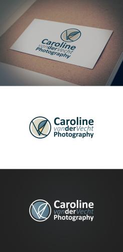
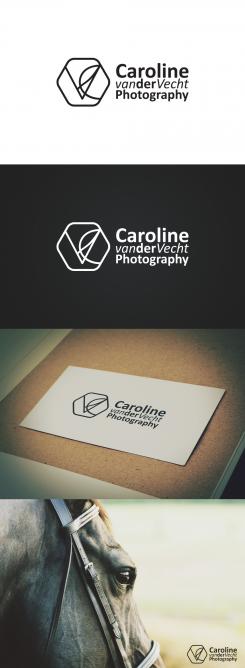
Now it's a C then V making one symbol.

This contest is finished. Its not possible to reply anymore.
logo-logotip-dizajn-2nd-Djztlobg

No comments

This contest is finished. Its not possible to reply anymore.
logo-logotip-dizajn-2nd-ULKr3LRg

No comments

FotocvFotocv

Hi, it's a Dutch website so please write fotografie instead of photography. I don't quite understand the image. V comes before C but website url is fotocv, so I would write the C before the V of you want to use my initials. In view of readability I would choose to write 'van der' in same style (italic or regular or other). In some of the designs I read: 'Caroline der Photography' and that seems strange to me.

2ND2ND

I thought it might be weird to use initials in this way, but also interesting, I have some new ideas so I will post them later. About 'van der', sorry, I got the point. I'm from Serbia so I guess I don't have feeling for international names. I will do as you said. Thank you.

This contest is finished. Its not possible to reply anymore.
logo-logotip-dizajn-2nd-Tj18FT3g

No comments

This contest is finished. Its not possible to reply anymore.
logo-logotip-dizajn-2nd-T6hPRafg

No comments

This contest is finished. Its not possible to reply anymore.
logo-logotip-dizajn-2nd-SUNgdiHg

No comments

This contest is finished. Its not possible to reply anymore.