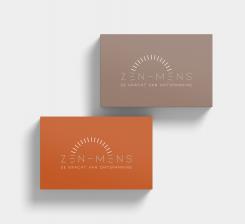
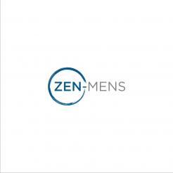
Create a simple down to earth logo for our company Zen Mens

Start date: 21-05-2020

Ending date: 28-05-2020

Total budget: € 329.00
Latest design
Book cover
lookaluuk

It all started with an idea...

A short, interactive guide helped them discover their design style and clearly captured what they needed.

Needs


In our company, Zen-Mens or (Zen-Mens.be) we guide people to the State of Relaxation, through guided relaxation exercises, Bodywork and a combination of the two. There are also weekly evenings where we practice for relaxation through slow/soft movements.

Our approach is down-to-earth. We like it when this is translated in the logo.

What we certainly do not want is that there is a link to spirituality. Although we have a lot of knowledge about this, this is certainly NOT the intention to reflect this in our communication (logo).
This knowledge made us understand humanity and that every being is perfect like he or she is.
If you feel that a certain symbolism does fit, feel free to create. We are open to see what comes out.

If you want more information, you can always leave a message.

We are really curious how your creative, but simple, down to earth designs will look like.

We wish you good luck, designers.

Creative greetings,
nova and luc

Company description


Hereby our vision mission.

Discover the power of relaxation.

The vision of nova and luc is that the first step to more happiness, freedom and success always starts from relaxation.
Achieve more with less effort!
They guide modern man to the State of Relaxation, so they can rediscovers its power and benefits of it.
This opens the way, for her and him, to a free, happy and successful life.

Thanks to the background of nova and luc, you learn through individual guidance and / or group activities what is real relaxation about. Physically, mentally and emotionally.
Afterwards you will learn to integrate this relaxation into your daily life.

This way you get the best out of yourself!

Target group


She or he who understands or is willing to understand that relaxation is an essential part of life, such as healthy food, hairdresser, etc ... they are more than welcome.
We are also happy to share our expertise for those for whom relaxation is completely new. Towards more balance in their lives.

Our current clients are managers, lawyers, accountants, some athletes (golfers - football) who visit regularly.

Colors, favourites and other requirements


We like earthly colours like sand, terra cota red/orange, yellow ocher and range of blues/green/turquoise.

Designer: deditri463 deditri463
logo-deditri463-l6CZ8NoO

No comments

This contest is finished. Its not possible to reply anymore.
logo-deditri463-kTsqKVQO

No comments

This contest is finished. Its not possible to reply anymore.
logo-deditri463-jrZ7Wd2O

deditri463deditri463

how about this one?please check

HolisticTempleHolisticTemple

Thank you for your input.

This one is a little to stiff.

This contest is finished. Its not possible to reply anymore.
logo-deditri463-icvfusGO

No comments

This contest is finished. Its not possible to reply anymore.
logo-deditri463-dgNtTrAO

deditri463deditri463

how about this one

HolisticTempleHolisticTemple

Thank you for your input.
This one is too straight for us.

This contest is finished. Its not possible to reply anymore.
logo-deditri463-cRkRs6OO

deditri463deditri463

how about this one?please check and feedback

HolisticTempleHolisticTemple

Thank you for your design.
This one we don’t like.

To stiff, business...
Thank you

HolisticTempleHolisticTemple

Most of our customers are business, managers, accountants etc.
So therefore we want them to surround them with relaxation energy, also in the logo.

This contest is finished. Its not possible to reply anymore.
logo-deditri463-aanHSTEO

No comments

HolisticTempleHolisticTemple

Thank you for your input.
This one is our favourite of all your designs.
Nice work.
Still something missing. We dont know what it exactly is...

This contest is finished. Its not possible to reply anymore.
logo-deditri463-x2R1yKG0

No comments

HolisticTempleHolisticTemple

Thank you for your input.
We like the style and the first impression, very simple and to the point.
We like the play of colours and the colours blue and gray. The circle is great, could be a little bit more brushy.

It is still not THE logo we are looking for but it is a good direction.
Thank you.

deditri463deditri463

oke thank you

This contest is finished. Its not possible to reply anymore.