No comments
Design a catchy logo for a coach and trainer in the personal development area
- Contest holder: kotimeike
- Category: Logo design
- Status: Ended
Start date: 24-07-2020
Ending date: 07-08-2020
It all started with an idea...
A short, interactive guide helped them discover their design style and clearly captured what they needed.
Brandsupply is a platform where creative professionals and businesses collaborate on unique projects and designs.
Clients looking for a new logo or brand identity describe what they need. Designers can then participate in the project via Brandsupply by submitting one or more designs. In the end, the client chooses the design they like best.
Costs vary depending on the type of project — from €169 for a business or project name to €539 for a complete website. The client decides how much they want to pay for the entire project.
No comments
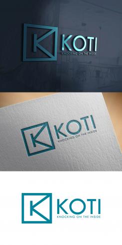
Hi, I am not sure yet if I prefer the K as the symbol or the full word KOTI after the symbol. The round version you made I don't like too much. did you choose the not line up the text with the lines from the symbol? I thought it might look nice if they did.
I also saw that someone 29design, made almost exactly the same design. Can you all see the other input and did they just copy yours because I gave you the most starts? That would be so rude!!
Hello
I have put 2 version of the logo with text above and below the symbol. The difference is the size of the text.
Yes, everybody see all the design on this contest and I think it is a copy of my logo because you gave it 5 stars.
Cordially
sariaka
No comments
hi, mooi logo. Ik weet niet precies waarom ,maar het spreekt me zeker aan. Voor mij is het ook belangrijk dat de woorden training en coaching er in terugkomen. Dat kan natuurlijk op de plek van knocking on the inside, maar wie weet zie jij nog een andere mogelijkheid?
Sorry, I am realising now that you are not dutch. I really like the logo. I do however want the words training en coaching to be in the logo. Can you think of another way then just replacing the words knocking on the inside? And I would also be interested in opening the right side of the square. As in 'you are inside, but you have an open view to the outside'.
Thanks very much
Meike
Hello
Thank you for your feedback.
I have put the logo with new modification.
Cordially
Sariaka
Hi Sariaka, Thanks for the modification. Right now my choice is between you and one other design.. I was wondering how it would look if the K symbol at the beginning is actually the K from Koti. Did you try that already, does it look nice?
Hello
I have put a logo with the symbole K at the beginning of the word KOTI
Cordially
Sariaka
 Nederland
 België
 France
 Deutschland
 Österreich
 International
