No comments
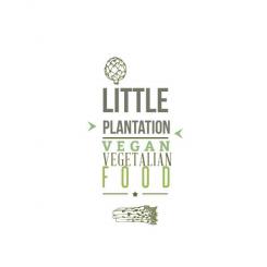
Design a clean and trendy logo for new vegan/vegetarian blog and website
- Contest holder: venusinblack
- Category: Logo design
- Status: Ended
Start date: 27-02-2014
Ending date: 11-03-2014
It all started with an idea...
A short, interactive guide helped them discover their design style and clearly captured what they needed.
Brandsupply is a platform where creative professionals and businesses collaborate on unique projects and designs.
Clients looking for a new logo or brand identity describe what they need. Designers can then participate in the project via Brandsupply by submitting one or more designs. In the end, the client chooses the design they like best.
Costs vary depending on the type of project — from €169 for a business or project name to €539 for a complete website. The client decides how much they want to pay for the entire project.
No comments
Hi there, as a design per se it is GREAT and so close to my original brief.
I think though that a linear design will just work better as a heading for my website/blog and above the cafe. But thanks so much for this inspiring design:)
No comments
This is the best of your designs. Thank you
Thank you so much. If you have suggestions, Tell me if you want that i change somethings . Cordially
No comments
???
I prefer the previous design. (the black one) I liked that the 'little' was a bit round.
Ok Tell me if you want me to adapt to the web and how
No comments
These are nice, but I think I prefer the layout of the previous design. I like the little ribbon at the bottom.
ok ! do you wan i let him as it was or should I make changes?
I would be so grateful if you could take the previous design, soften it and make the little corrections. Many thanks for your hard work.
Thank you so much and sorry for my bad english :) tell me what kind of corrections should I bring .
is that the letters you like or do I resume the previous?...
No comments
I really like this and feel that - with one of the previous designs - it is most closely matched to what I envisaged in my mind when I set the brief. So thanks for understanding the concept.
A few things to make it better - date is 2014, also, can we 'distress' the letters and make it a bit softer and more vintage? I also don't want it to say Web and coffee. I may or may not in future have a tag line on the bottom but for now I want the image to speak for itself and don't want too many words to need to explain what it is. So perhaps date in the banner instead? Also - instead of vegetarian food at the top, can you just write 'the' in that writing. Thanks so much, really like this:)
Hello. Thank you for your comment.Ok! I make the changes and present it soon.
So instead of - vegetarian food, please write THE
instead of web and coffe perhaps place the sicne 2014 in the ribbon
when I say soften I mena - colour slightly softer colours. when I mean distress think little white patches o the font and/or font a hint more feminine. I am not a designer but that's what I feel, a bit more vintage..I hope this helps
Hello, Here is a first proposal. I am at your disposal for your comments and suggestions. Good luck with your project. Cordially.
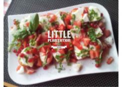
So cool - this is So NOT what I had in mind, but works really well. I love the soft grey colour you chose, it makes it feminine (my target group) without being in your face about it. The veggies are too big for me though and make the design an inch too busy. Please can you include the word THE. Thanks again:)
 Nederland
 België
 France
 Deutschland
 Österreich
 International
