No comments
Design a cool logo for Flip the script
- Contest holder: estherteunissen
- Category: Logo design
- Status: Ended
Start date: 17-02-2021
Ending date: 20-02-2021
It all started with an idea...
A short, interactive guide helped them discover their design style and clearly captured what they needed.
Brandsupply is a platform where creative professionals and businesses collaborate on unique projects and designs.
Clients looking for a new logo or brand identity describe what they need. Designers can then participate in the project via Brandsupply by submitting one or more designs. In the end, the client chooses the design they like best.
Costs vary depending on the type of project — from €169 for a business or project name to €539 for a complete website. The client decides how much they want to pay for the entire project.
Thank you! Of these two logos, the top one appeals to us the most (so withouth the domino dots). Nice that you drew the stones from this perspective. It is too static for us right now though. We would like to feel liveliness and movement in the logo.For example because you see in the logo that the stones actually fall over or with color or in another way.
Oh and the first stone may be very small. This symbolizes that even with a first very small step you can initiate big changes.
We are struggling a lot, because there is no logo yet that is 'it'. So we want to abandon the idea of the domino bricks. We think it's too much thought in our heads, but when we look at the stones in the logo's, it does not makes us happy.
That's why we'd like to open it up completely and see what comes.
If we're honest, at this point we have no idea what our logo should look like. We hope this doesn't block your creative inspiration...
tell me whats you like, whats you seen with this idea, it could be annything, the place you work some stuff in your company,the way you guys work, serious or playfull, modern or traditional, how is your target market. hopefully it can help you find the ideas about the logo spec
What do u think ?
Thank you! We've been doing a lot of thinking based on the logos that have now come in, thank you for participating! We like both of your logo's, but it's not THE logo ;)
We have come to an idea and it would be super to receive designs for it. I adjusted the briefing with information.
No comments
I like the conceptual idea of this logo. With a logo like this we can tell a story.
dear contest owner,please send me a feedback, to make my logo on point. thank you. and hope you like my logo
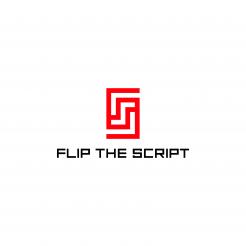
dear contest owner,this my ambigram logo is suitable for your newest brief, if u flip the logo the form is still the same that is represent creativity, the top and bottom f make the symbol of handshake that represent a teamwork.the red color mean the power to replace the current power of the structure
 Nederland
 België
 France
 Deutschland
 Österreich
 International
