logo presentation
Design a logo for a Physical Therapy / Performance center
- Contest holder: Patrick Slegtenhorst
- Category: Logo design
- Status: Ended
- Files: File 1, File 2, File 3
Start date: 26-04-2016
Ending date: 10-05-2016
It all started with an idea...
A short, interactive guide helped them discover their design style and clearly captured what they needed.
Brandsupply is a platform where creative professionals and businesses collaborate on unique projects and designs.
Clients looking for a new logo or brand identity describe what they need. Designers can then participate in the project via Brandsupply by submitting one or more designs. In the end, the client chooses the design they like best.
Costs vary depending on the type of project — from €169 for a business or project name to €539 for a complete website. The client decides how much they want to pay for the entire project.
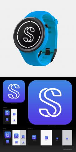
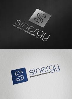
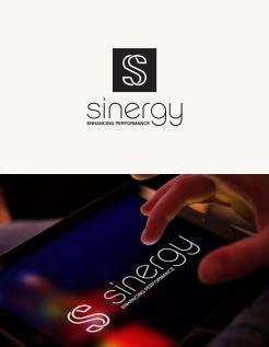
Here is my concept for your logo based on the two joint letters "S" referring not only to the initial letter of the logo title but also to its meaning.
The logo is clean, simple, modern, dynamic and suitable for online and offline media, for web and for print. It works great in full color and black & white, at all sizes, on different backgrounds and materials. The logo image can be used separately or in combination with the name. It works well both as horizontal and vertical version, with or without the square ["S" background].
Please, don't forget to enlarge/click on the images to see the actual colors and details.
Your feedback [in Dutch or English] is welcome.
Kind regards,
Lyra
 Nederland
 België
 France
 Deutschland
 Österreich
 International


