No comments
Design a logo for a (starting) cleaning company that emits professionalism, reliance and trust.
- Contest holder: FCS.Roh
- Category: Logo design
- Status: Ended
Start date: 04-05-2015
Ending date: 18-05-2015
It all started with an idea...
A short, interactive guide helped them discover their design style and clearly captured what they needed.
Brandsupply is a platform where creative professionals and businesses collaborate on unique projects and designs.
Clients looking for a new logo or brand identity describe what they need. Designers can then participate in the project via Brandsupply by submitting one or more designs. In the end, the client chooses the design they like best.
Costs vary depending on the type of project — from €169 for a business or project name to €539 for a complete website. The client decides how much they want to pay for the entire project.
"other font"
Do You like "news font"? thanks.
No comments
"other font"
Do You like "news font"? thanks.
No comments
Selenia,
Thank you for the design. The bubbles look fine. But we are still ambivalent about the font.
Today we won't be able to comment on the new designs. As soon we are able to comment we will get back to you.
Thank you
thanks for the rating and comments!
No comments
like that?
? ^^
Selenia,
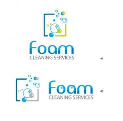
This design comes much closer to our vision than the previous. We think that the bubbles would look better in a light shade of blue, instead of grey. Also we aren't sold on the font.
It just doesn't stand out (without standing out).
Also the illustration could stand a bit closer to the name.
We certainly like the way this is evolving.
Thank you.
No comments
Thank you for your comments!
Here's the updated design.
best regards
selenia
Hi Selenia,
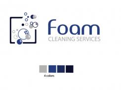
We like the 2nd design. Maybe you could use a darker shade of blue for the name and we don't know about the accents in the O and A. For the illustration maybe you could use different shades of blue (dark, darker, darkest) and use the grey (but maybe not as a primary color for the frame).
Thank you for the designs and we hope that you'll give it another go.
Yes, I will make the change.thanks!
No comments
Hi, here is my idea for your logo.
I would like to hear your opinion.Click on the image for better resolution and view!
Kind regards,
selenia
Hi Selenia,
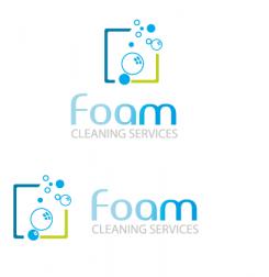
We have to say that we like where you're going with this. The bubbles do have a certain charm, but maybe you could make an illustration with foam, or something more abstract. Also try a different color combination.
Also the way the color builds up from the F to M is something we're ambivalent about. Maybe begin the sequence with more color or make it one color.
I hope the comments are clear and you will give it a go.
Thanks again for this design.
Yes, I will make the change.thanks!
 Nederland
 België
 France
 Deutschland
 Österreich
 International
