No comments
Design a logo for an innovative sport company!
- Contest holder: FlexSporten
- Category: Logo design
- Status: Ended
Start date: 19-07-2018
Ending date: 26-07-2018
It all started with an idea...
A short, interactive guide helped them discover their design style and clearly captured what they needed.
Brandsupply is a platform where creative professionals and businesses collaborate on unique projects and designs.
Clients looking for a new logo or brand identity describe what they need. Designers can then participate in the project via Brandsupply by submitting one or more designs. In the end, the client chooses the design they like best.
Costs vary depending on the type of project — from €169 for a business or project name to €539 for a complete website. The client decides how much they want to pay for the entire project.
I was thinking you could use the "X" and shadow as an emblem?
oh... you mean a gradient :)
Like this?
Yes this is exactly what we meant. And now we only want to see some different color combinations. The word flex in a shade of dark grey and sporten and the shadow of the x with the orange and some other colors. Like a shade between red and pink.
Yes this is exactly what we meant. And now we only want to see some different color combinations. The word flex in a shade of dark grey and sporten and the shadow of the x with the orange and some other colors. Like a shade between red and pink.
Brighter colors and a more modern font for "SPORTEN"
Hello Anna,
We like this shape more and the font style as well. Only the sharp points on the N is a bit odd. So that can be straight. With 'coming to the front' we mean that I miss a bit gloss. Like some of the other designs. But it can be that it is because of using another program.
Kind regards,
Simon & Thijs
Hi Simon and Thijs :)
Here is another go with the bolder first design and second thinner one but with extra depth to them...
Let me know what you think
Thanks Anna
Hello Anna,
We really like the position of all the letters now and especially the 'E' and the 'X'. We think it can be a bit more fresh by using some brighter color tones and let the letters coming more to the front. A bit like some other designs here. The font style can also be a bit more modern in our opinion. But as I said, the position of everything is really good now.
Kind regards,
Simon & Thijs
I dont quite understand when you say " let the letters coming more to the front"? :)
Hello
here is another one with the same feel as the other one but an extra symbol that may be used alone, I'm trying a different color also as I'm not too sure what you like?
Let me know
Thanks
Anna :)
Hello Anna,
Thanks again for your design. We still really like the word 'Flex'. So you should keep that. Also the font style is much better. But the position of the words were better in the previous design. So 'Flex' bigger than 'Sporten'. We also don't know what to think of the infinity symbol. It's not really original and has not much to do with our brand. About the colors, we like this combination. But we want to see some other combinations with turquoise or other shades of blue.
Kind regards,
Simon & Thijs
hehe :) it wasnt really the infinity sign... i was trying for flexibility in motion and it turned into the infinity sign...
HI
thank you for your feedback
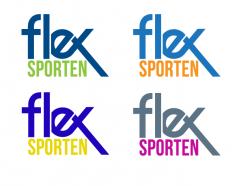
here is another one a bit more simple and modern with a few color variations
:) Anna
Hello Anna,
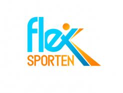
Thank you for your design. We really like what you did with putting 'Flex' and 'Sporten' under each other. We also like the creativity with the letters E and X. So keep that in mind. We only think that it can be a bit more modern.
Kind regards,
Simon & Thijs
 Nederland
 België
 France
 Deutschland
 Österreich
 International
