No comments
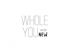
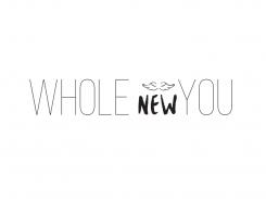
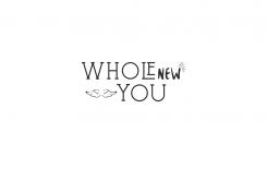
Design a logo for my blog, Whole New You
- Contest holder: wnyblog
- Category: Logo design
- Status: Ended
- Files: File 1, File 2
Start date: 27-11-2015
Ending date: 04-12-2015
It all started with an idea...
A short, interactive guide helped them discover their design style and clearly captured what they needed.
Brandsupply is a platform where creative professionals and businesses collaborate on unique projects and designs.
Clients looking for a new logo or brand identity describe what they need. Designers can then participate in the project via Brandsupply by submitting one or more designs. In the end, the client chooses the design they like best.
Costs vary depending on the type of project — from €169 for a business or project name to €539 for a complete website. The client decides how much they want to pay for the entire project.
No comments
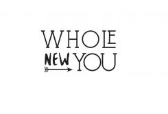
My preference goes to the previous logo, especially the font used for "NEW" and the arrow. The line below the "You" seems a bit irrelevant / redundant in this new design, and the playfulness / optimism of the previous logo is a bit lost in the current logo.
No comments
Hi! Thank you for you submission. I like your proposals and style. Nevertheless, I do think the logos are still quite 'busy' looking, too much is going on (for this reason I prefer the 2nd and 3rd logo over the one with the stars). My preference goes to a more 'subtle' logo with a little less interaction. E.g., by using a smaller arrow like in your 2nd example, or a size in between the arrow size in the 2nd and last example. I like the 3 symbolic meaning of the 3 feathers at the end of the arrow though, so please don't change that ☺. I also like the fonts you've used, though it'd be nice to see an example without the O and the U in "You" touching. Looking forward to see another option. Thanks!
Hi! Thank you for you submission. I like your proposals and style. Nevertheless, I do think the logos are still quite 'busy' looking, too much is going on (for this reason I prefer the 2nd and 3rd logo over the one with the stars). My preference goes to a more 'subtle' logo with a little less interaction. E.g., by using a smaller arrow like in your 2nd example, or a size in between the arrow size of your 2nd and last example. I like the symbolic meaning of the 3 feathers at the end of the arrow though, so please don't change that ☺. I also like the fonts you've used, though it'd be nice to see an example without the O and the U in "You" touching. Looking forward to see another option. Thanks!
 Nederland
 België
 France
 Deutschland
 Österreich
 International
