No comments
Design a minimalist fresh logo for a new sustainable scented candles clothing brand!
- Contest holder: Shaine
- Category: Logo design
- Status: Ended
Start date: 30-03-2021
Ending date: 20-04-2021
It all started with an idea...
A short, interactive guide helped them discover their design style and clearly captured what they needed.
Brandsupply is a platform where creative professionals and businesses collaborate on unique projects and designs.
Clients looking for a new logo or brand identity describe what they need. Designers can then participate in the project via Brandsupply by submitting one or more designs. In the end, the client chooses the design they like best.
Costs vary depending on the type of project — from €169 for a business or project name to €539 for a complete website. The client decides how much they want to pay for the entire project.
No comments
greeting
the thickness of the sign is
as letter thickness
No comments
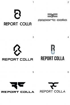
Could you make the lines of the logo itself (not the name) thinner ? So that we have an idea of it.
This logo attracts our attention, maybe you can do something more with it?
Could you also make this the logo in the colors of our mood board? (One in beige, one in gold-bronze-like, one in brown and one in green)
We think these mediocre lines are slightly better than the super thin lines.
Thanks for the effort!
We think these mediocre lines are slightly better than the super thin lines.
Could you only do the logo in those colors? (so the 'RC'), we find thin lines a bit less. We think the middle logo is great!
Sorry, hopefully you understand a little bit what we mean :)
No comments
The number 1 emblem has something we kinde like. We are curious what it would be like if the lines are (a bit) thinner.
kinda*
 Nederland
 België
 France
 Deutschland
 Österreich
 International
