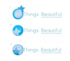
Like this maybe?
Cheers Mark
Design a strong and fresh logo for a new health coaching business
- Contest holder: sleung
- Category: Logo design
- Status: Ended
Start date: 20-07-2014
Ending date: 10-08-2014
It all started with an idea...
A short, interactive guide helped them discover their design style and clearly captured what they needed.
Brandsupply is a platform where creative professionals and businesses collaborate on unique projects and designs.
Clients looking for a new logo or brand identity describe what they need. Designers can then participate in the project via Brandsupply by submitting one or more designs. In the end, the client chooses the design they like best.
Costs vary depending on the type of project — from €169 for a business or project name to €539 for a complete website. The client decides how much they want to pay for the entire project.
I think the original one is the strongest. I just like to have a meaning behind this logo. The circle representing the water fits, but the moon not so, though it looks nice in this logo. Stella means star, so that's why I wanted to have a star in it. But it's not a must.
If you wand i cane make anny couler tha you wish...
regards Mark
You cane click on the picture for better view..
That's a bit too much. Would you be able to replace the moon with a star or half of a star? The rest leave as the original proposal.
Yes no problem..
Good day, this is our first proposal for your logo, feedback is Welcome, we are very curious what you think of it. You can click the picture for the actual size and color shade, we provide the files in every conceivable format .jpg .gif .eps .png .psd .pdf and of course the .ai (adobe illustrator verctor format) for all your expressions.
Cheers Mark
Hi Mark, I really like the freshness of the logo and the emphasise on All. I also like the font and that you have changed the tagline a bit;). What does the circle stand for? Does it stand for water and goes into a moon? Would you be able to to the circle and going into a star? Overall I'm happy with this direction.
Thanks for the rating, it is indeed the water and the moon, I'll see whether I can make to integrate the stars. The font is IOS7 so very modern, I'll be with you with a new proposal in a minute.
Regards Mark
 Nederland
 België
 France
 Deutschland
 Österreich
 International


