No comments
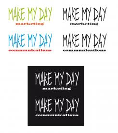
Design a youthful and inspiring logo + stationary for a new company in the communication and travel branch
- Contest holder: linanijman
- Category: Logo design
- Status: Ended
Start date: 25-02-2015
Ending date: 08-03-2015
It all started with an idea...
A short, interactive guide helped them discover their design style and clearly captured what they needed.
Brandsupply is a platform where creative professionals and businesses collaborate on unique projects and designs.
Clients looking for a new logo or brand identity describe what they need. Designers can then participate in the project via Brandsupply by submitting one or more designs. In the end, the client chooses the design they like best.
Costs vary depending on the type of project — from €169 for a business or project name to €539 for a complete website. The client decides how much they want to pay for the entire project.
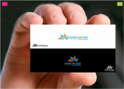
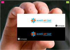
Good day, this is my first proposal for your logo, feedback is Welcome, i am very curious to hear what you think and feel on it. You can click the picture for the actual size and color shade, i provide the files in every conceivable format .jpg .gif .eps .png .psd .pdf and of course the .ai (adobe illustrator verctor format) for all your expressions.
Regards WhiteCat
I like the logo and the fact that the people are connected. Fresh colors used. Can you work it out a bit more? Maybe the icon is too simplified, and too 'straightforward'. Maybe something more inspiring or less clean/medical can be selected.
Thanks for your scoring and feedback...i didn't understood your point of " less clean / medical can be selected " can you explain littlle more clearly
Sorry for the confusion. What I mean is that the icon could be coming from a medical environment. It looks a bit simplistic. Can you try out some other versions with a different type of icon? (I do like the idea of the people being connected/holding hands). Maybe the icon needs to be bit bigger or expressed different. When using in black and white it becomes a bit unclear on what it is. (it looks like a star with dots).
 Nederland
 België
 France
 Deutschland
 Österreich
 International


